
Complications
What complications are, how one design shows data from many sources, and how to make one step by step.
On a watch, a complication is anything a watch face shows besides the time: the date, the weather, your next appointment, the battery level. The word comes from watchmaking, where every extra feature made the mechanism more complicated.
On Wear OS, complications work in a special way, and that’s what makes them powerful: the watch face decides how the data looks, and the wearer decides which data it shows. Apps on the watch offer data (the weather app offers the temperature, the calendar your next event), and the wearer picks one of them for each complication, on the watch itself.
A design, not a piece of data
Section titled “A design, not a piece of data”So a complication you make in Pujie is not a “weather complication” or a “battery complication”. It’s a design for a kind of data: a style that says “a short line of text goes here, with an icon above it”. Whatever source the wearer picks, the temperature, the step count or the sunrise time, your design shows it.
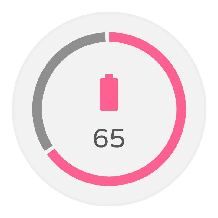
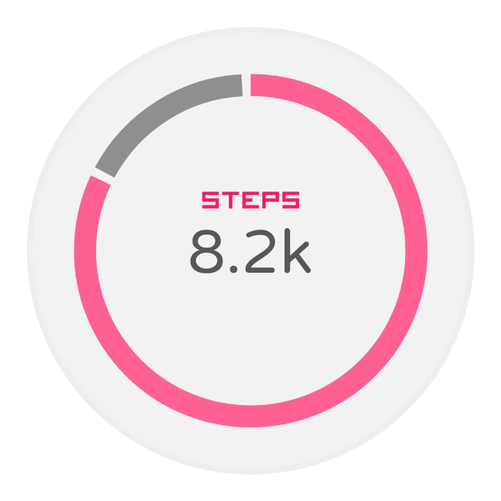
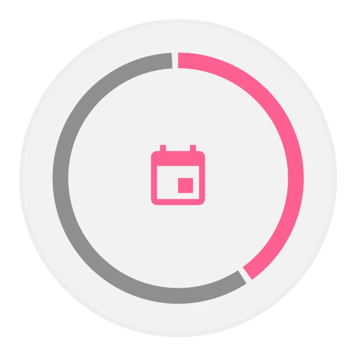
That’s the one idea to hold on to. It feels unusual at first, but it means one design works with every app on the watch, including apps that don’t exist yet. Here one ring design shows the battery, the step count and a calendar countdown, whichever the wearer picks:
Kinds of data
Section titled “Kinds of data”Sources offer their data in a few fixed shapes, called types. A step counter might offer a number on a scale (ranged value) and a short text; a music app a small image. Your complication says which types it can show:
| Type | What it holds | Always | Sometimes |
|---|---|---|---|
| Short text | A short line of text: steps, a temperature, a label | Short text | Icon, short title |
| Long text | A longer line: a calendar event, a description | Long text | Long title, icon, small image |
| Ranged value | A value on a scale, to draw as a gauge: battery, steps toward a goal | Value, minimum, maximum | Icon, short text, short title |
| Icon | A single-color icon, which you can tint | Icon | |
| Small image | A small picture: album art, an app’s icon | Small image, as a photo or as an icon | |
| Large image | A full-size picture, for a background | Large image |
The “sometimes” fields are what makes designing interesting: a source may send them or not. A battery source gives a value and maybe an icon; another ranged value source might add a short text. A good design looks right either way.
More than one type
Section titled “More than one type”A complication can support several types. The more it supports, the more sources the wearer can choose from. The order matters: when a source offers more than one of your types, the watch uses the one highest in your list, so put the type you designed most carefully, usually the richest, first.
What you can make
Section titled “What you can make”A few complications from the Library and from Pujie users, each showing a value of 65 out of 100 with a battery icon. Tap one from the Library to open it there.
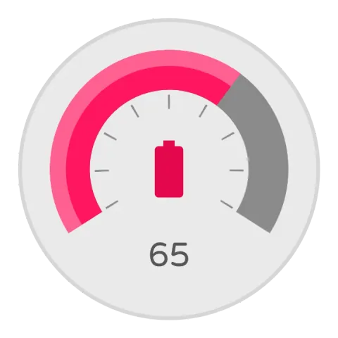 ValueA gauge with an arc and a needle. Without an icon, the needle shows.
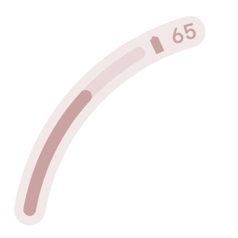 Arc ComplicationAn arc along the edge of the watch, with the icon and text at its end.
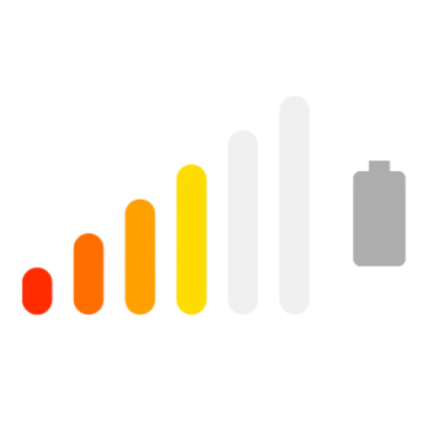 BarsSix bars that light up one by one as the value goes up.
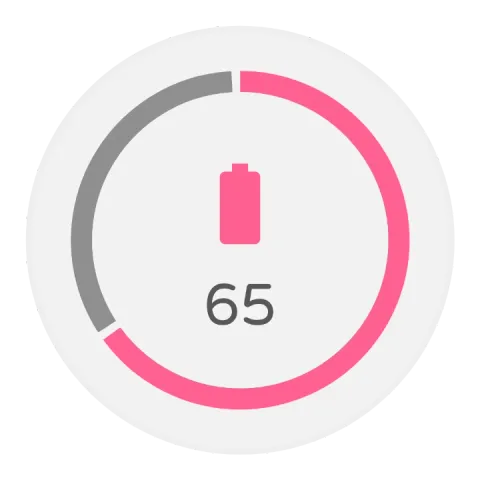 RingA ring that fills, with the icon and text in the middle.
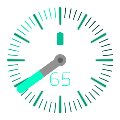 Needle gaugeA dial with a needle that turns with the value.
Making a complication, step by step
Section titled “Making a complication, step by step”1. Pick the types
Section titled “1. Pick the types”Tap the add button above the element list, pick Complication, then New item. The first thing you see is the Supported data types sheet:
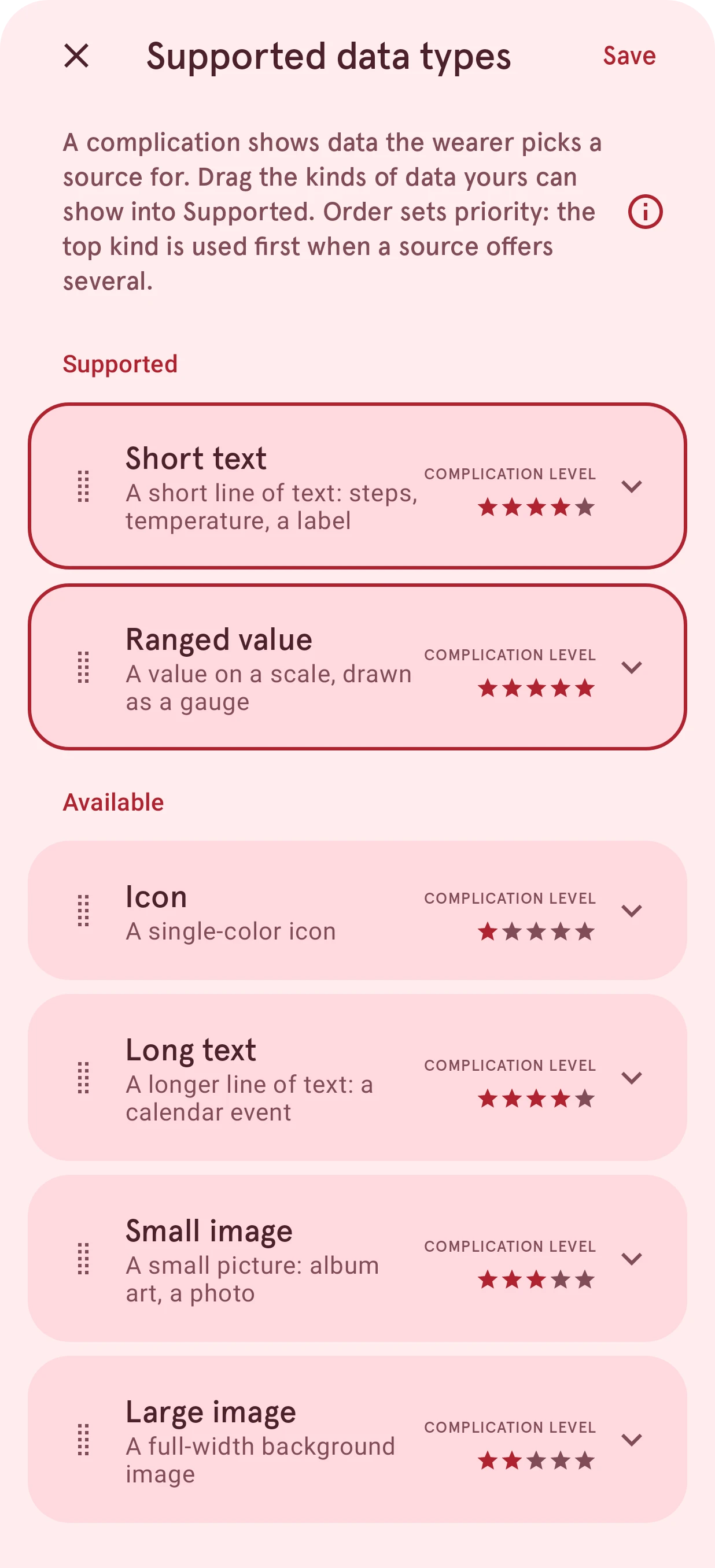
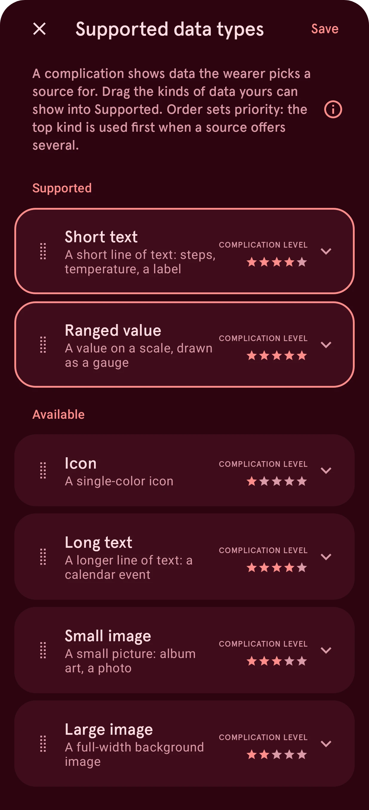
Drag the types your design will show from Available up into Supported, in order of priority, and tap Create. Tap the arrow on a card to see which fields that type always has and which ones it may have; the stars rate how much a type can show, from one for an icon to five for a ranged value. Not sure? Start with just Short text: it’s the type most sources offer. See Supported data types.
You can also start from a complication someone else made: pick From the watch face library instead of New item.
2. Design it
Section titled “2. Design it”The new complication opens in the watch element designer, with starter layers already in place: one for each field of the types you picked, such as the text, the title or the icon. These layers are bound to their field: on the watch they show the source’s data. They’re marked Locked in the layer list, so a swipe can’t remove them by accident.
Now style them the way you like: fonts, colors, sizes, positions, and anything you want around them, like a ring, a background or a gauge needle. Everything you can do in the watch element designer works here.
- Text fields are tags in a text layer:
[cstext]is the short text,[cstitle]the short title,[cltext]and[cltitle]the long ones. You can add them to any text layer, with other text around them. - Images and icons are image layers bound to a field. To bind one, pick the field as the layer’s image in Image source.
- Values drive automation:
[cvalue],[cmin]and[cmax], and[cnormval], the value as a fraction from 0 to 1, which is the easiest to use. Turn a needle with it, or let an arc grow with it. - Optional fields may be empty. A starter layer for an optional field says so in its name. If your design doesn’t need one, hide the layer instead of deleting it.
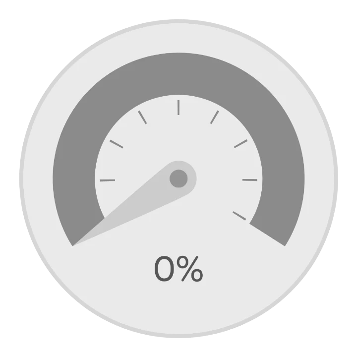
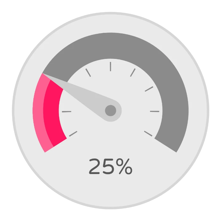
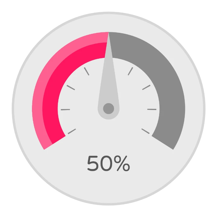
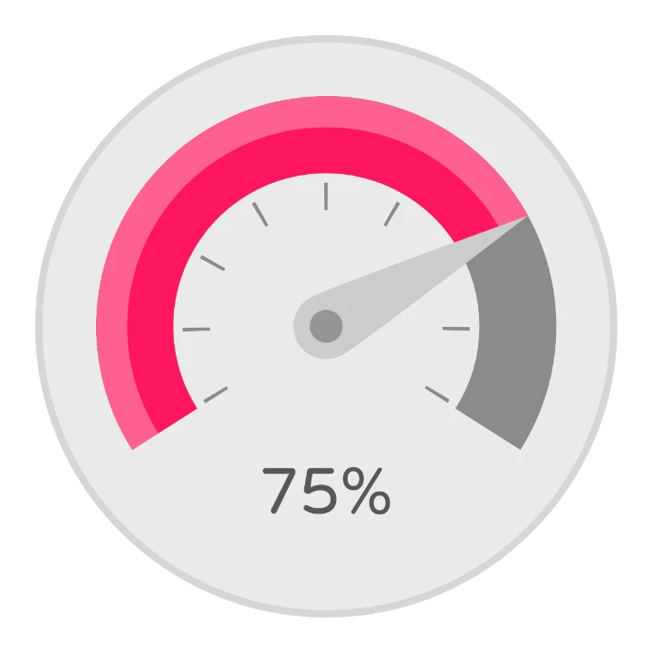
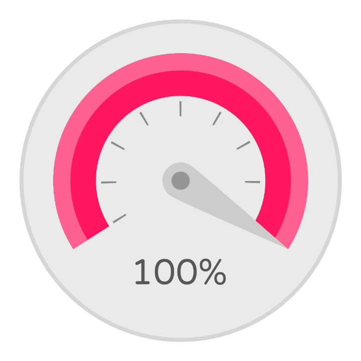
In the Value complication, the needle’s rotation and the arc’s angle both follow the value: the
needle turns ([cvalue]-[cmin])/([cmax]-[cmin])*245 degrees, the share of the range times the 245
degrees of the dial, and the arc’s sweep uses the same formula. Bars shows each bar only above its own
share, with visibility [cnormval]>(2/6) for the third one. Here’s Value from 0 to 100:
3. Try it with real data
Section titled “3. Try it with real data”At the top of the watch element designer, Complication data opens Pick your complication data: the data sources you can preview your design with.
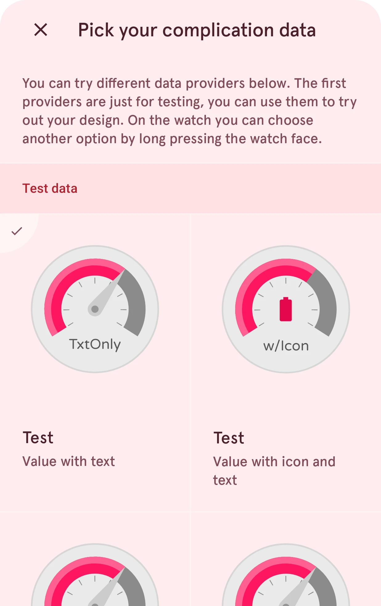
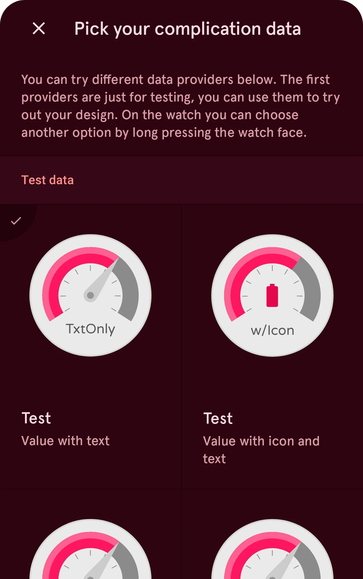
The first sources are Test data: made-up values that show each combination of fields, like text only, text with an icon, or text with a title. Go through all of them: your design should look good with each one. Below them are real sources, such as the date, the battery, the heart rate or the step count.
When something should only show for some data, use automation to hide it. Each type has a marker that
is true when that type is showing, such as [cisshorttext] or [cisrangedvalue], and each field has
one that is true when the source sent it, such as [chicon] for the icon. When you support several
types, the starter layers that belong to only one of them already hide themselves this way.
4. Set the tap area
Section titled “4. Set the tap area”A complication can be tapped on the watch. By default the tap area is a rounded box the size of the complication. To give it your design’s shape, choose Set as outline in the menu of a shape or arc layer: an ellipse gives a round tap area, an arc an arc-shaped one.
5. Put it on the watch face
Section titled “5. Put it on the watch face”Back in the watch face designer, place the complication with its position and size. On its row, the complication data button picks the source it starts with: the data the watch shows until the wearer picks something else. Pick a real source here, not a test one.
On the watch
Section titled “On the watch”The wearer chooses the data on the watch: long-press the watch face, tap the customize or edit button under it, and tap the complication. The watch lists every source that offers one of your types. Each complication is named after its element, so give your complications clear names, like “Top left” or “Small gauge”.
Tapping a complication on the watch is up to the source; usually it opens the app the data comes from.
Good to know
Section titled “Good to know”- At most 8 complications on a watch face, the interactive and the always-on face together.
- Short or long? Most sources offer short text. Choose long text only when your design has room for a sentence.
- Complications show on the always-on face too. Add one to the ambient elements for it, and keep it calm: no bright backgrounds.
- Quick data without a choice: when the data should always be the same (always the battery, for instance), a dynamic element is simpler: you put the data in yourself, and the wearer doesn’t need to pick anything.