
Color
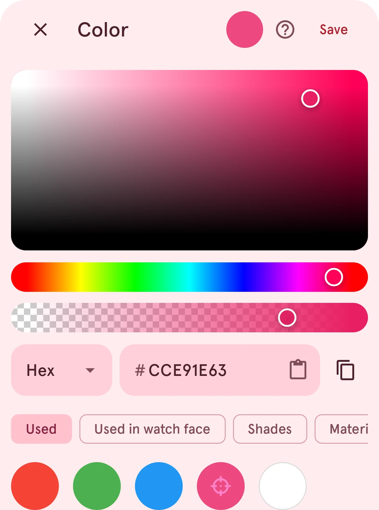
Pick a color on the color square, by its value, or from the colors already in your design.
Opens from any color swatch: a layer’s fill or stroke, a stop in the gradient picker, a color in the watch face’s palette tab, or one in an element’s Adjust palette sheet.
Picks a color: drag on the square and the sliders, type the color’s value, or take one from the colors you used before. Tapping outside the sheet or swiping it down doesn’t close it, so a color you’re working on isn’t lost by accident.
Close
Closes the sheet and keeps the color you had.
Picked color
The color you’ve picked so far.
Save
Keeps the picked color.
Saturation and brightness
Drag across it to set how strong the color is (left to right) and how bright (top to bottom), in the hue the slider below sets.
Hue
Drag along it to pick the hue: red, yellow, green, blue and back to red.
Opacity
How see-through the color is, from fully transparent on the left to solid on the right. It only shows where the setting can be see-through.
Format
How you type the color: Hex (
FF5722), RGB (red, green and blue from 0 to 255), HSV (hue, saturation and brightness) or HSL (hue, saturation and lightness).Color value
The color in the chosen format. In hex, the paste button in the field pastes a color you copied elsewhere; with opacity, the hex value starts with two digits for the opacity.
Copy hex color
Copies the hex value, to paste it in another color.
Color schemes
Colors to pick from, in tabs:
- Used: the colors you picked recently.
- Used in watch face: the colors of the face you’re designing, most used first, so a design stays consistent. It only shows when there’s a face.
- Shades: lighter and darker versions of the picked color.
- Material: color palettes built from the picked color, in a few styles.
- Harmonies: colors that go with the picked color by color theory: its complementary color (opposite on the color wheel), the split-complementary pair either side of that, and analogous neighbors. A gray has no hue, so it gets no harmonies.
Tap a swatch to pick it.