
Fill
The fill of a layer: colors, gradients, polished metal and presets, and the effects over it (texture, pattern, lighting, bevel), with every setting.
The fill is built in two parts. The fill style is what the surface is: a color, a gradient, or Shaped, polished metal such as gold or steel laid out in a shape. Under it, the Fill effects list holds what is done to that surface, each effect in a card: a pattern, lighting, a texture or a bevel.
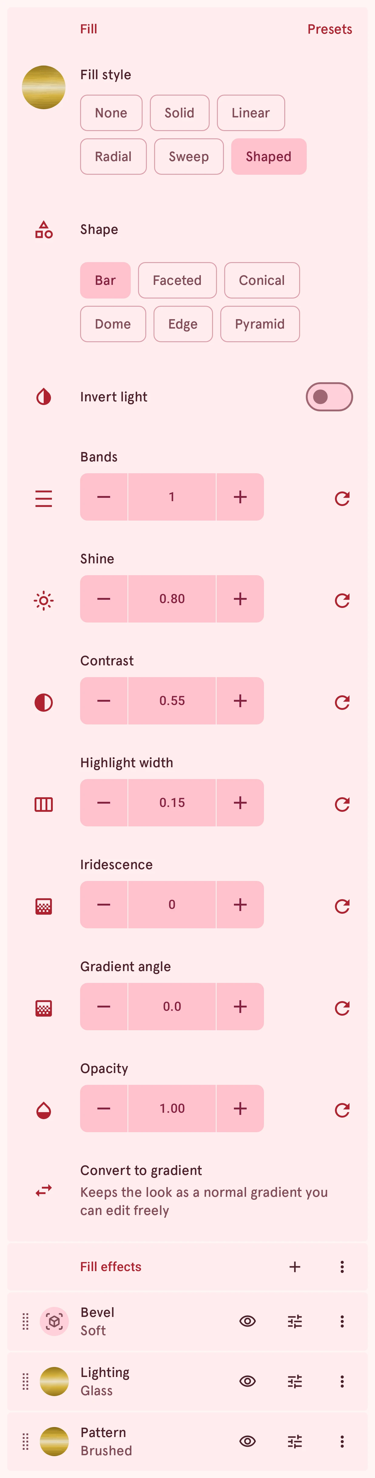
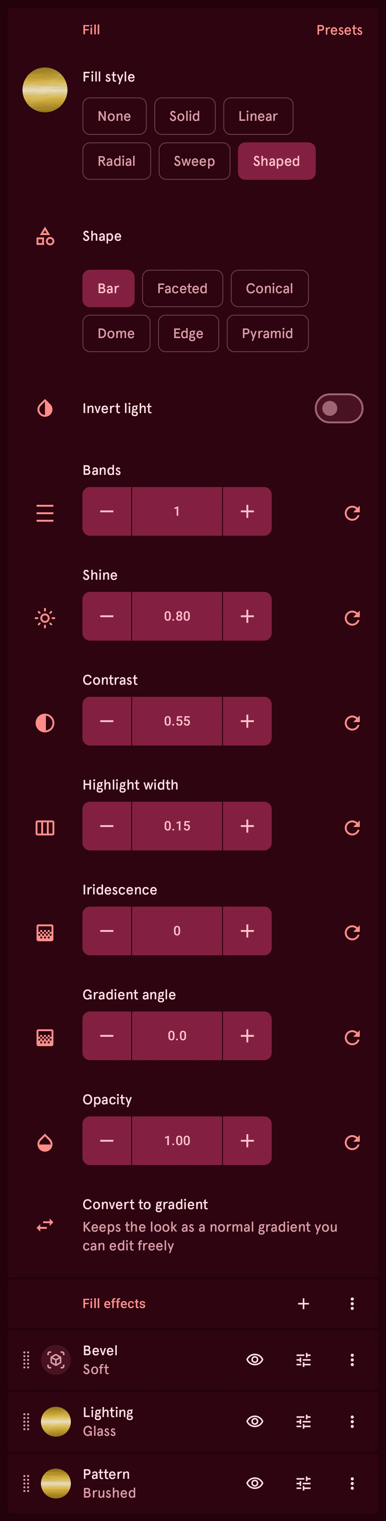
- Presets: every look in one sheet; a preset sets the fill style and its effects at once. See Presets.
- Fill style: None, Solid, the gradients, or Shaped. Tap the swatch for the color or the gradient.
- Shaped settings: the shape the light falls in and how glossy it is. See Shaped: polished metal.
- Convert to gradient: turns a Shaped fill into a normal gradient you can edit stop by stop.
- Add effect: a pattern, lighting, a texture or a bevel. See Effects. The ⋮ next to it shows, hides or removes all effects at once.
- Drag a card to reorder. The list shows the top effect first: it lies over the ones below it.
- Show or hide an effect. A hidden effect keeps its settings, isn’t drawn and never blocks sending.
- Adjust an effect: its settings open under its card.
- The card’s menu: duplicate or delete the effect.
Solid and gradients
Section titled “Solid and gradients”The fill style’s first choices are the plain ones. Here each in the same two colors:
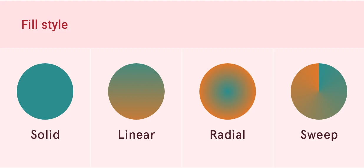
- None: no fill. The layer shows only its stroke, if it has one.
- Solid: one color. Tap the swatch to pick it in the color picker, with its transparency.
- Linear: colors blending along a straight line, like light falling from one side.
- Radial: colors blending from the center outward, like a glow or a dome.
- Sweep: colors turning around the center, like the hand of a clock. Ideal for rings and progress arcs.
For a gradient, tap the swatch to open the gradient picker: add, move and recolor its color stops, each with its own opacity. Ready-made gradients are in Presets. Gradient angle turns a linear or sweep gradient, and Gradient direction flips it so it runs the other way. Every color in a fill is part of the watch face’s palette, so recoloring the face there recolors these too.
Presets
Section titled “Presets”Tap Presets for every look in one sheet. A preset sets the fill style and its effects at once; change anything afterwards. Your colors shows each look in the element’s own color and the other colors of your watch face: tap a color dot to see the looks in that color. Polished does the same for nine metals (gold, silver, chrome, rose gold, copper, titanium, blued steel, aluminum and dark steel), each polished, brushed, with sun rays or with rings. The rest are fixed looks: gradients, carbon fiber, pearls, screens and textures.


Shaped: polished metal
Section titled “Shaped: polished metal”The Shaped fill style draws metal in one color: a dark, a main and a pale shade of it, laid out so it catches the light like a real surface. The shape decides where the light falls. Gold in each shape:
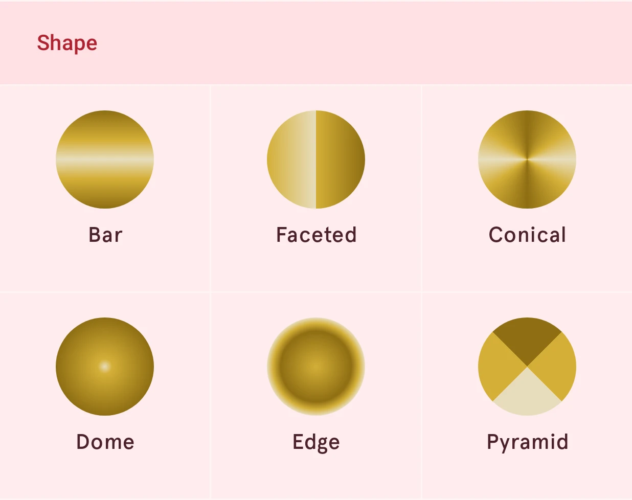
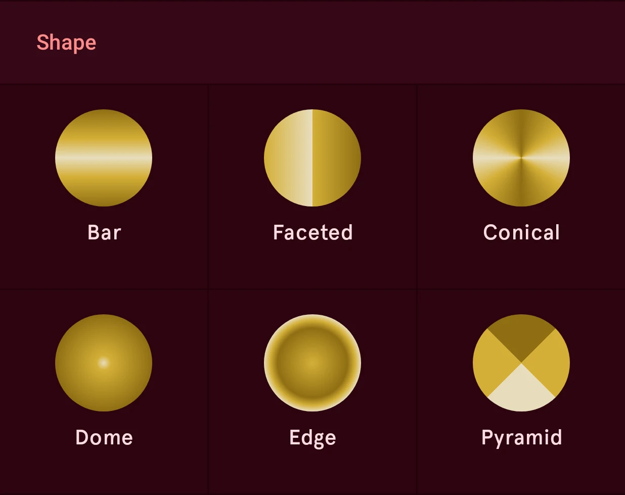
- Bar: a smooth band of light across the shape. The classic polished hand or index.
- Faceted: a hard split into a light and a dark half, like a machined ridge on a baton index.
- Conical: light that turns around the center, like a turned or sunray dial.
- Dome: a light center fading to a dark edge, like a polished cap or a round button.
- Edge: dark inside, bright at the rim, like a bezel. On a stroke it lies across the stroke’s own width.
- Pyramid: four sharp facets meeting in the middle, like a pyramid-cut index.
Gradient angle turns the light, Invert light swaps light and dark, and Bands repeats the light like the reflections on chrome. Shine, Contrast and Highlight width set how glossy it looks: a narrow, bright highlight with deep shadows reads as chrome, a wide, soft one as satin. Iridescence turns the metal into pearl. Each setting is explained under Fill style settings.
Fill style settings
Section titled “Fill style settings”The settings of the fill style’s card, the first card on the Fill page. Which of them show depends on the fill style: the gradient rows for a gradient, the metal rows for Shaped.
Fill style
ChoiceHow the inside is filled. None leaves it empty and Solid uses one color. The gradients blend colors: linear along a line, radial from the center out, sweep around the center. Shaped is polished metal in one color, lit in a shape (see Material and Shape below). Tap the swatch to pick the color or the gradient.
- None
- Solid
- Linear
- Radial
- Sweep
Material
ChoiceThe material the surface is made of. Polished is metal: a dark, a main and a pale highlight shade of one color, laid out in a shape (below); it’s what the Shaped fill style draws. Woven and Printed are carbon fiber, woven tows with their own shine or a flat print; Iridescent is mother of pearl. Those three are textures with a pattern of their own: picking one adds it as a Texture effect.
- None
- Polished
- Woven
- Printed
- Iridescent
Main color
ColorThe color the metal is built from. Its dark and pale shades follow from it, so one color is enough.
Shape
ChoiceHow the light falls on polished metal. Bar is a smooth band of light across the shape, Faceted a hard split into a light and a dark half (a machined ridge), Conical light that turns around the center (a turned or sunray dial), Dome light in the middle fading to dark at the edge, Edge dark inside and bright at the rim, and Pyramid four sharp facets meeting in the middle, as on a pyramid-cut index. The light comes from the Gradient angle.
- Bar
- Faceted
- Conical
- Dome
- Edge
- Pyramid
Facet split
ChoiceFor Faceted only: which way the split runs. Auto splits along the length of the shape, which suits hands and indices; Vertical gives a left and a right half, Horizontal a top and a bottom half.
- Auto
- Vertical
- Horizontal
Invert light
SwitchSwaps light and shadow in the shape: a bar becomes light at both sides with a dark band in the middle, a dome dark in the middle with a bright rim.
Bands
NumberHow many times the shape’s light repeats across the layer: several bars, rings or turns, like the many reflections on chrome. 1 is the plain shape. Pyramid always has its four facets.
1 to 8, steps of 1
Shine
NumberHow strongly the metal catches the light: how bright its highlight is.
0.00 to 1.00, steps of 0.01
Contrast
NumberHow dark the metal’s shadow side gets. Low is soft, satin metal; high is mirror-like chrome.
0.00 to 1.00, steps of 0.01
Highlight width
NumberHow wide the band of light is, as a share of the layer. Narrow reads as highly polished metal, wide as brushed or satin. Only Bar, Conical and Dome have such a band.
0.05 to 0.60, steps of 0.01
Iridescence
NumberShifts the colors beside the highlight toward other hues, in degrees, which turns the metal into pearl. 0 is plain metal.
0 to 120, steps of 1
Gradient angle
NumberThe direction a gradient runs, in degrees, or where the light on polished metal comes from.
0.0 to 360.0, steps of 0.1
Can be automated.
Gradient direction
SwitchSwaps the ends of the gradient, so it runs the other way.
Opacity
Number0 is fully transparent, 1 fully opaque. Lower it to let the layers below show through.
0.00 to 1.00, steps of 0.01
Can be automated.
Effects
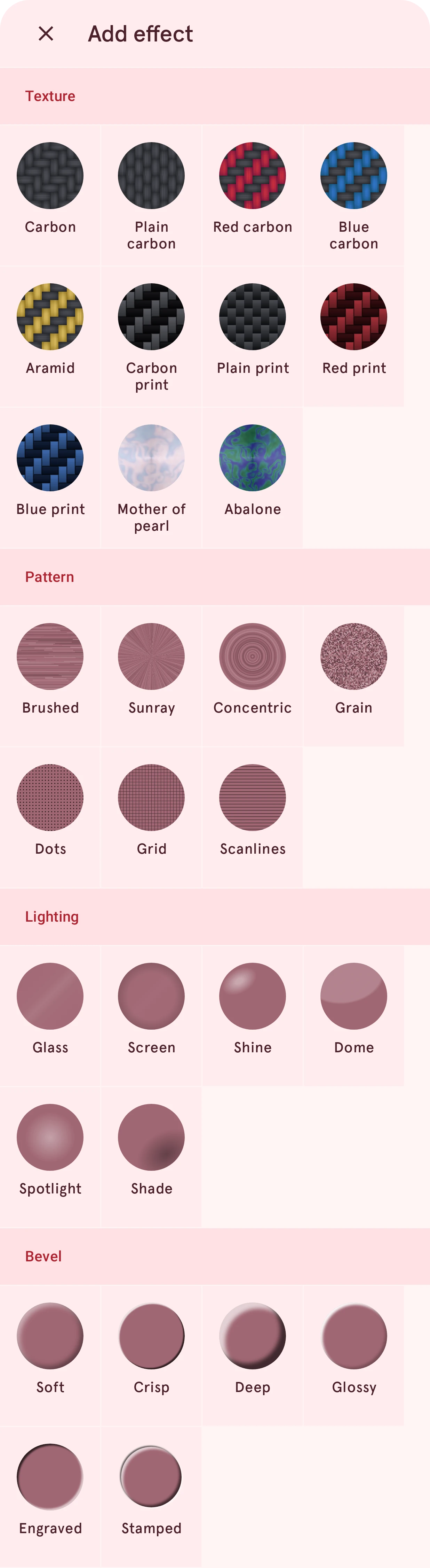
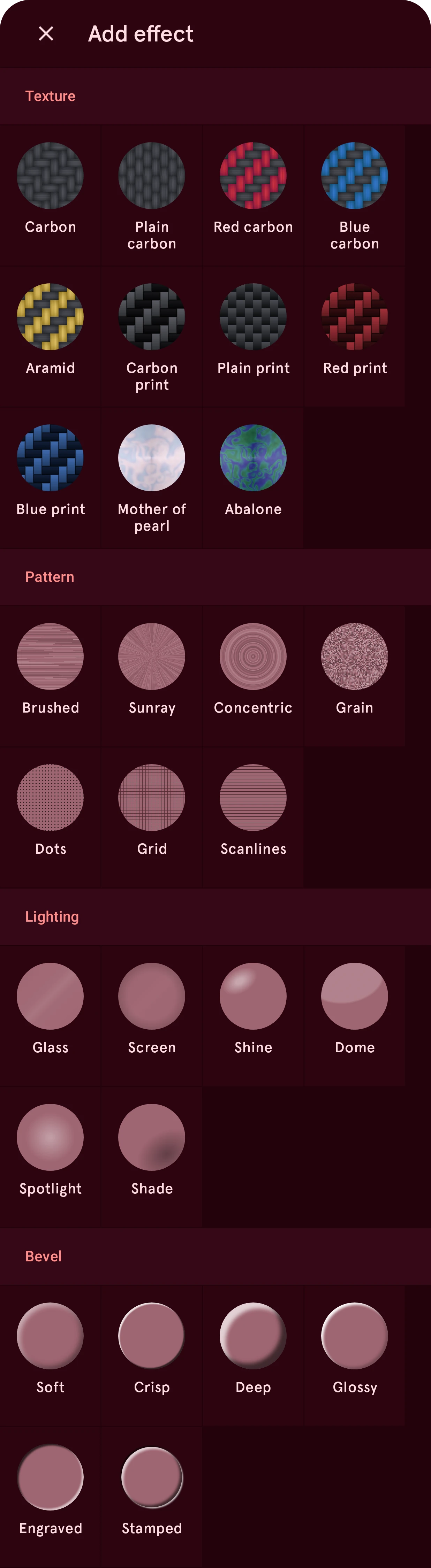
Section titled “Effects”Tap + above the Fill effects list to add an effect. The sheet shows every effect with its looks, each on a gray swatch; tap one to add it as a card, already open so you can tune it.
Texture
Section titled “Texture”A material with a pattern of its own, drawn over the fill style. One per fill; lower its opacity to let the fill style show through.
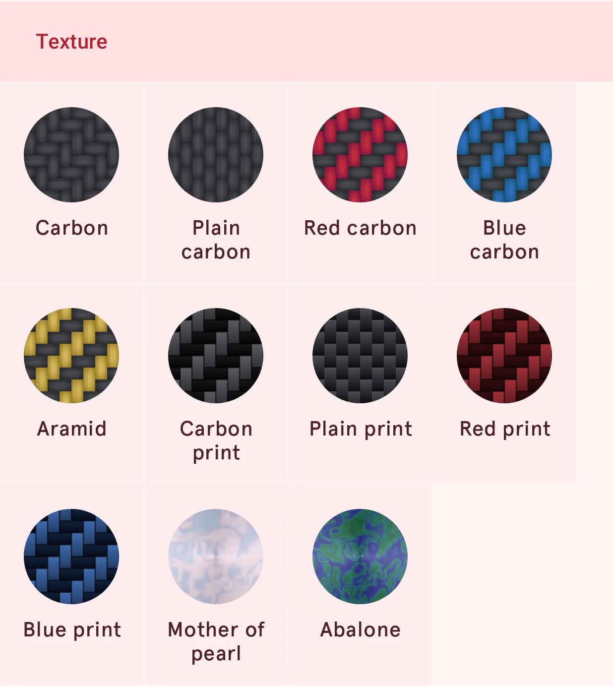
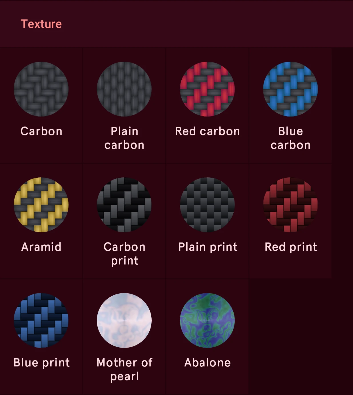
- Woven carbon (Carbon, Plain carbon, Red carbon, Blue carbon, Aramid): woven tows that catch the light along their strands. Twill weave gives the familiar diagonal steps, plain weave a checked look. The colored ones have a second color for the crossing tows.
- Printed carbon (Carbon print, Plain print, Red print, Blue print): the same weave as a flat print, each float a smooth gradient between two colors, with no shine of its own. Add Lighting for a lacquer gloss.
- Iridescent (Mother of pearl, Abalone): banded nacre whose colors shift; Softness blurs the bands.
Texture settings
Section titled “Texture settings”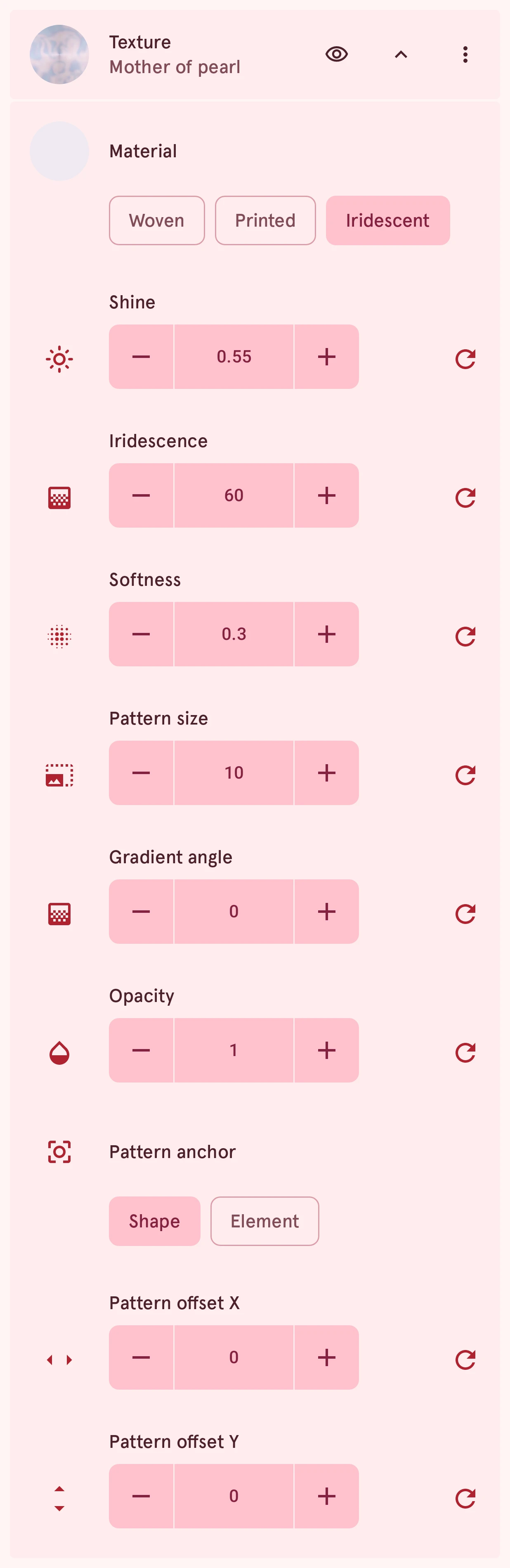
Material
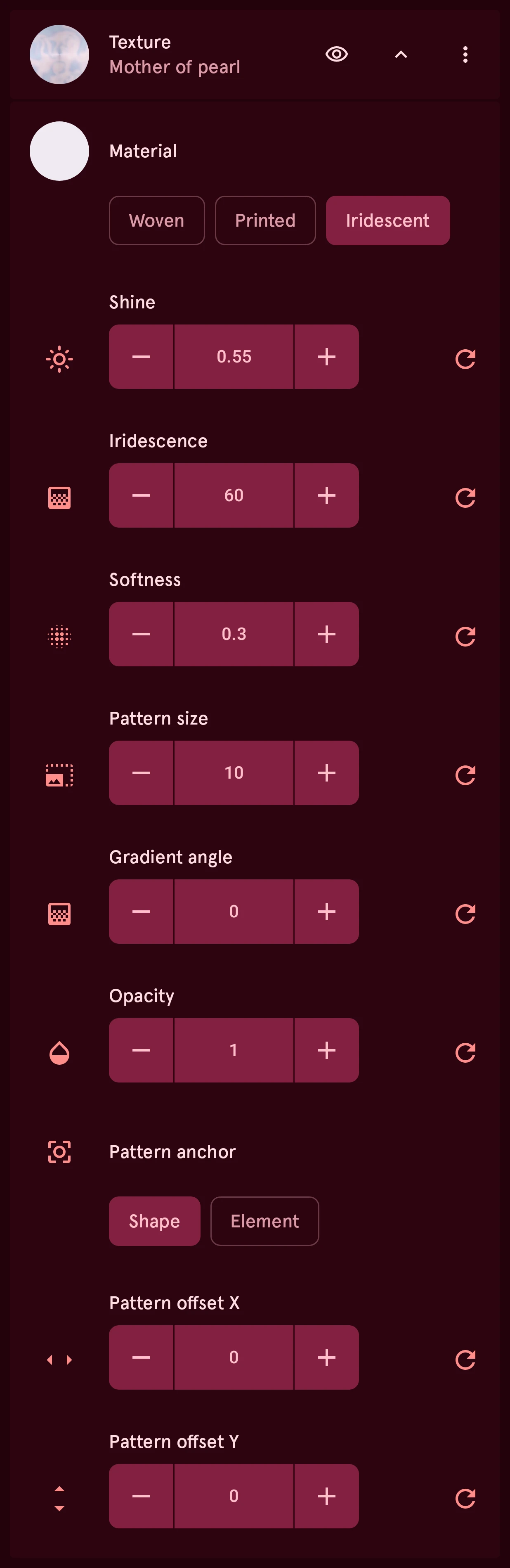
ChoiceWhich texture: Woven carbon (woven tows that catch the light along their strands), Printed carbon (the same weave as a flat print, with no shine of its own) or Iridescent, mother of pearl. Switching starts from that texture’s standard look in the current colors.
- Woven
- Printed
- Iridescent
Main color
ColorThe texture’s base color: the carbon’s, or the pearl’s. Its swatch sits in the Material row; for a carbon it holds both colors and asks which one to edit.
Secondary color
ColorA carbon’s second color: the crossing tows of woven carbon, or the far end of each printed float.
Weave
ChoiceFor carbon only: how the tows are laid. Twill crosses each tow over two, which gives carbon its diagonal steps; Plain goes over one and under one, a checked look.
- Twill
- Plain
Shine
NumberHow strongly the texture catches the light: the sheen along woven carbon’s strands, the shimmer of mother of pearl. Printed carbon is flat and has none; for a lacquer or glass shine on top, add Lighting.
0.00 to 1.00, steps of 0.01
Iridescence
NumberFor mother of pearl: how colorful its bands are, in degrees of hue.
0 to 120, steps of 1
Softness
NumberFor mother of pearl only: how blurred its bands are, from crisp (0) to very soft (1).
0.00 to 1.00, steps of 0.01
Pattern size
NumberThe size of the texture’s pattern: how big the weave of a carbon or the bands of mother of pearl are. It grows and shrinks with the element.
1.0 to 24.0, steps of 0.5
Gradient angle
NumberTurns the texture: the direction of the weave or the bands.
0.0 to 360.0, steps of 0.1
Can be automated.
Opacity
NumberHow much the texture covers what lies under it, from 0 (the fill style shows through) to 1.
0.00 to 1.00, steps of 0.01
Pattern anchor
ChoiceElement keeps the pattern in place when you resize or move the shape
What the texture is pinned to: the shape, or the element. Works as for a pattern; see Pattern anchor.
- Shape
- Element
Pattern offset X
NumberShifts the texture to the right (negative: to the left) from its anchor, in design units.
-100.0 to 100.0, steps of 0.1
Pattern offset Y
NumberShifts the texture down (negative: up) from its anchor, in design units.
-100.0 to 100.0, steps of 0.1
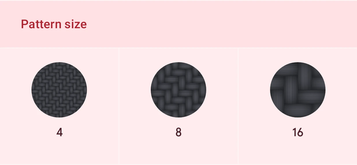
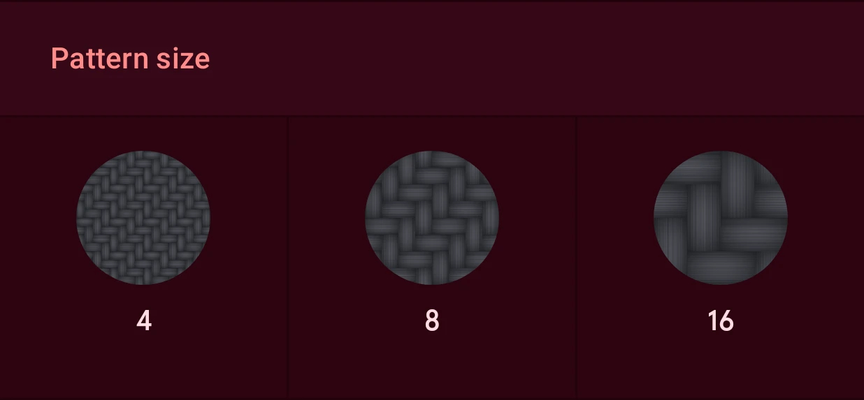
The pattern size of a carbon, at half, the standard and double:
Pattern
Section titled “Pattern”Marks over everything below them. A fill can have up to four, for example rays with grain on top. Here each pattern lies over polished gold:
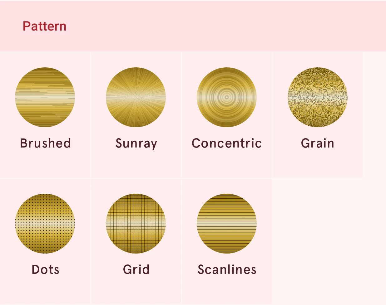
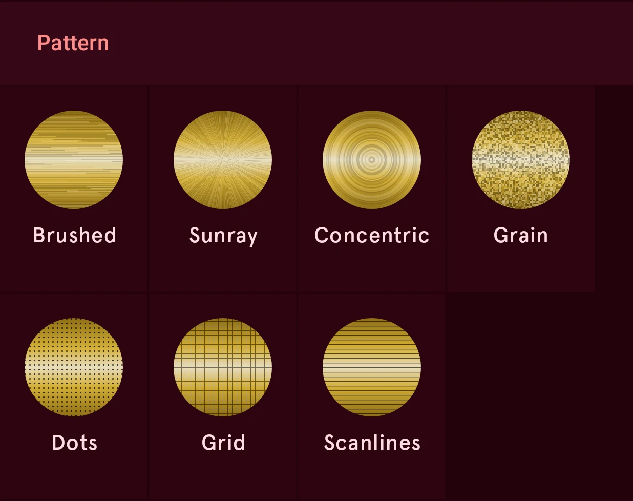
- Brushed, Sunray, Concentric, Grain: finishes in light and shade: straight brush strokes, rays from the center, rings around the center, fine specks. They have no color of their own and no shine; the light across them comes from the fill below, so brush a polished Bar and put rays or rings on a Conical one.
- Dots, Grid, Scanlines: marks drawn in a color, like the pixels, gaps and lines of a screen. Put them over a bright or glowing fill for an LCD or a dot-matrix display.
Strength, Density and Size tune the marks; the pattern grows and shrinks with the element.
Pattern settings
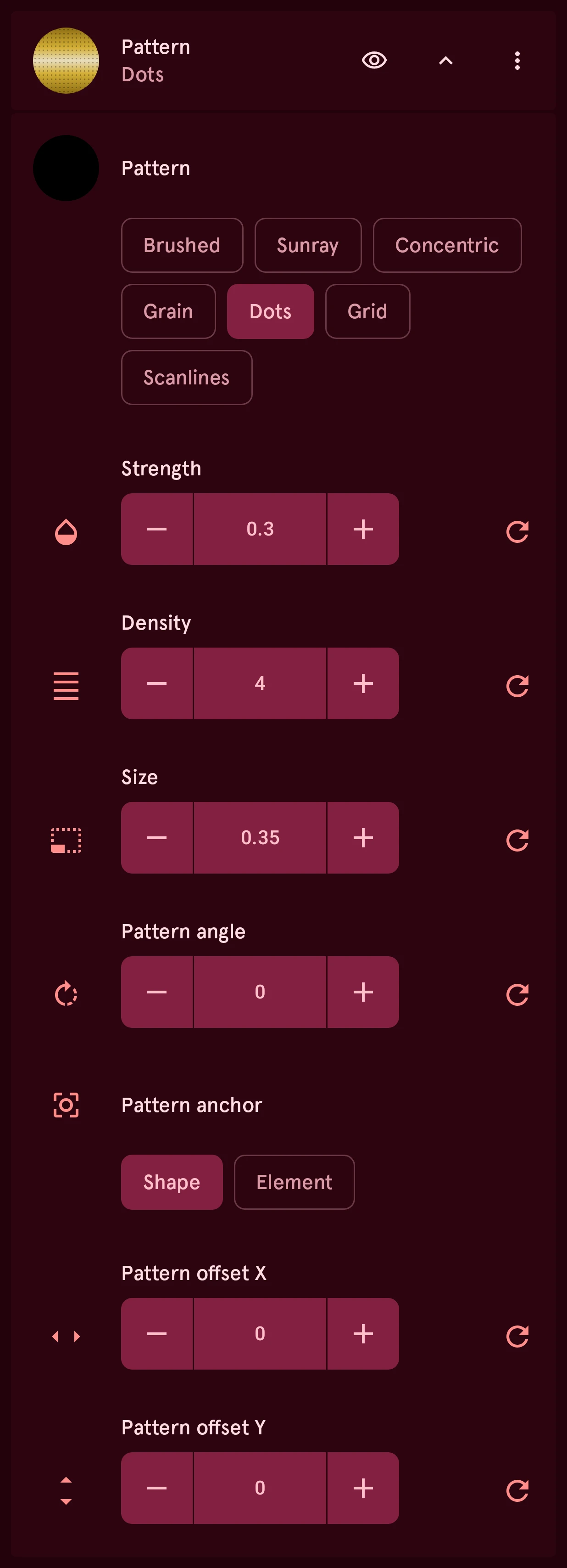
Section titled “Pattern settings”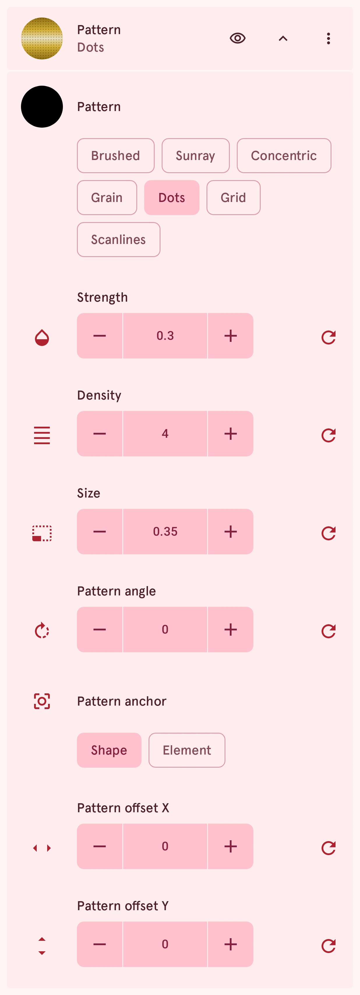
Pattern
ChoiceThe marks the pattern draws. Brushed, Sunray, Concentric and Grain are finishes in light and shade: straight brush strokes, rays from the center, rings around the center, and fine specks. They have no shine of their own, so the light across them comes from the paint below: brushing looks best on a polished Bar, rays and rings on Conical. Dots, Grid and Scanlines are drawn in a color, like the pixels, gaps and lines of a screen.
- Brushed
- Sunray
- Concentric
- Grain
- Dots
- Grid
- Scanlines
Pattern color
ColorThe color of the dots, grid or lines; its swatch sits in the Pattern row. The brushed, ray, ring and grain finishes have no color: they lighten and darken the paint.
Strength
NumberHow strong the marks are, from invisible (0) to full: the ink’s opacity, or how much a finish lightens and darkens.
0.00 to 1.00, steps of 0.01
Density
NumberHow close together the marks are. Higher gives more, finer marks: more dots and lines, narrower strokes, rays and rings, smaller specks. The pattern grows and shrinks with the element.
0.5 to 24.0, steps of 0.1
Size
NumberFor Dots, Grid and Scanlines: how big a dot is, or how thick a line, as a share of the space between them.
0.05 to 1.00, steps of 0.01
Pattern angle
NumberTurns the pattern: the direction of the brush strokes, the scanlines or the grid. Sunray and Concentric are laid out from the center, so the angle doesn’t change them.
0 to 360, steps of 1
Pattern anchor
ChoiceElement keeps the pattern in place when you resize or move the shape
What the pattern is pinned to. Shape lays it out from the middle of the shape, so resizing the shape from a corner slides the pattern along with that middle. Element pins it to the element’s own center instead: resizing, reshaping or moving the shape never moves the pattern, and shapes in the element that use the same pattern line up with each other. On an Index, Element lays the pattern out on the dial: all marks show parts of one continuous pattern, as if cut from one sheet, and “Keep the surface direction” doesn’t turn it. Shape gives every mark its own copy instead.
- Shape
- Element
Pattern offset X
NumberShifts the pattern to the right (negative: to the left) from its anchor, in design units (the dial is 320 wide). Use it to line the pattern up with another shape, or to move the middle of Sunray and Concentric.
-100.0 to 100.0, steps of 0.1
Pattern offset Y
NumberShifts the pattern down (negative: up) from its anchor, in design units.
-100.0 to 100.0, steps of 0.1
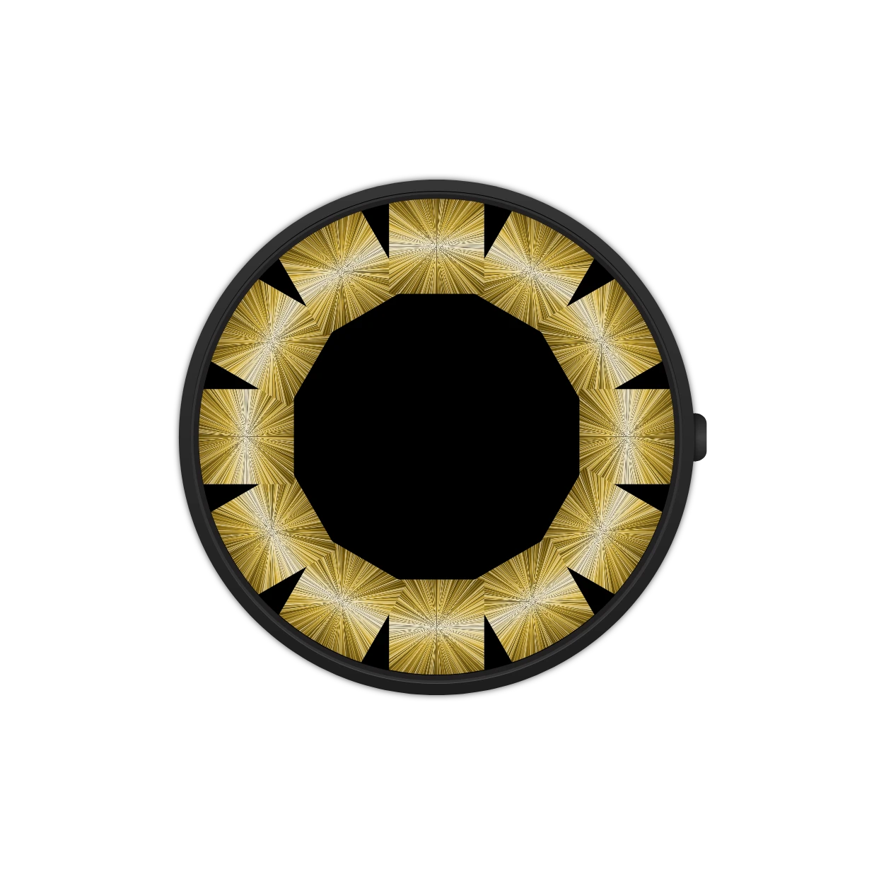
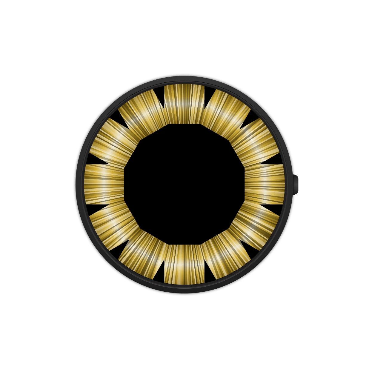
On an index, the anchor decides whether the marks share one pattern. Here twelve gold marks with Sunray, first pinned to each mark (Shape), then to the dial (Element), where the rays run out from the dial’s center across all of them:
Lighting
Section titled “Lighting”Light and shade over the whole fill, as if the element sat under glass. One per fill. Here on a deep blue:
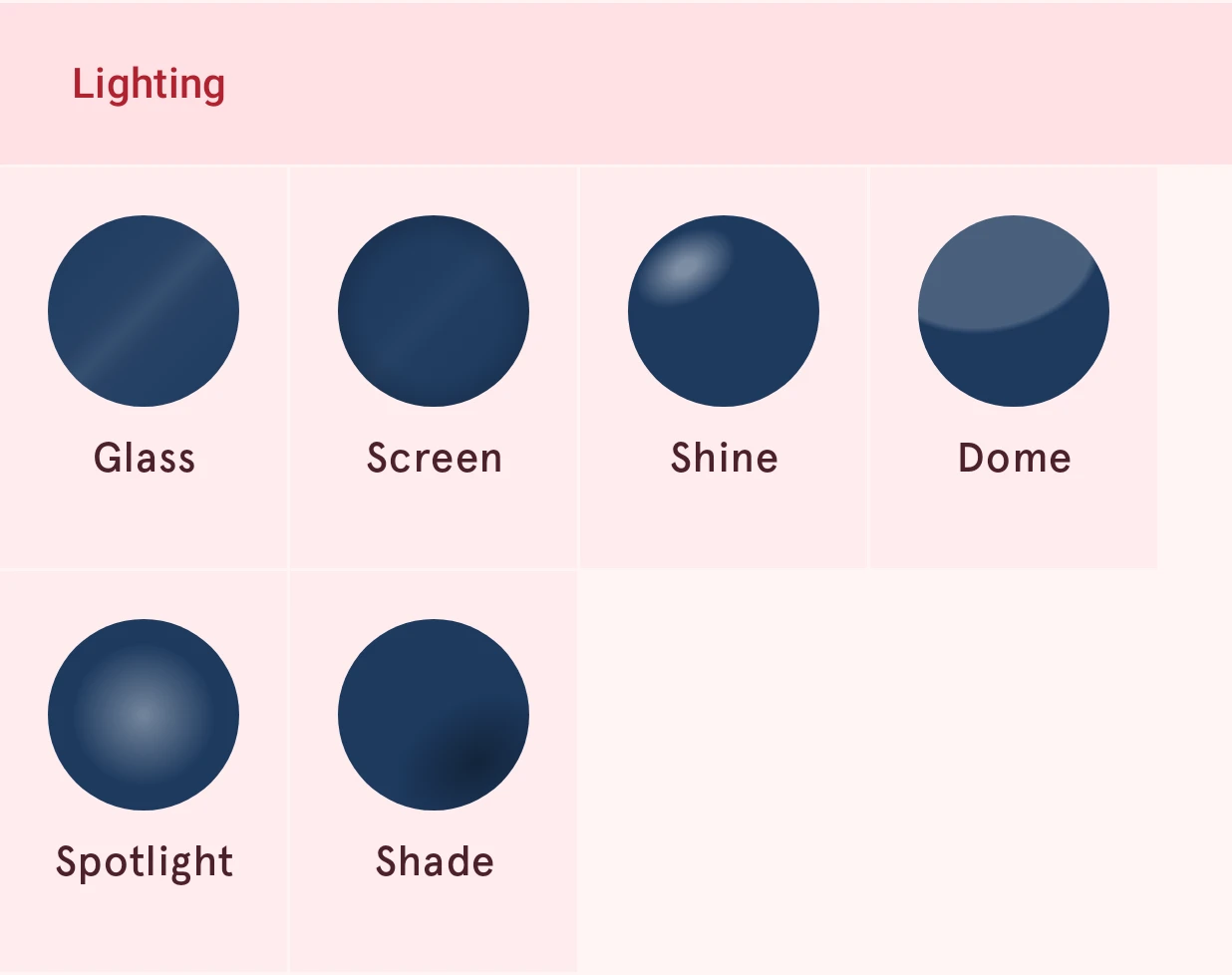
- Glass: a reflection band, as on a watch crystal.
- Screen: darker edges with a faint reflection, like a screen seen at a slight angle.
- Shine: a soft oval of light toward the top left, as on a glossy button.
- Dome: a large, faint reflection across the top: the curve of a domed crystal.
- Spotlight: a soft pool of light in the middle.
- Shade: a soft dark oval toward the bottom right, so a flat element looks curved.
Lighting settings
Section titled “Lighting settings”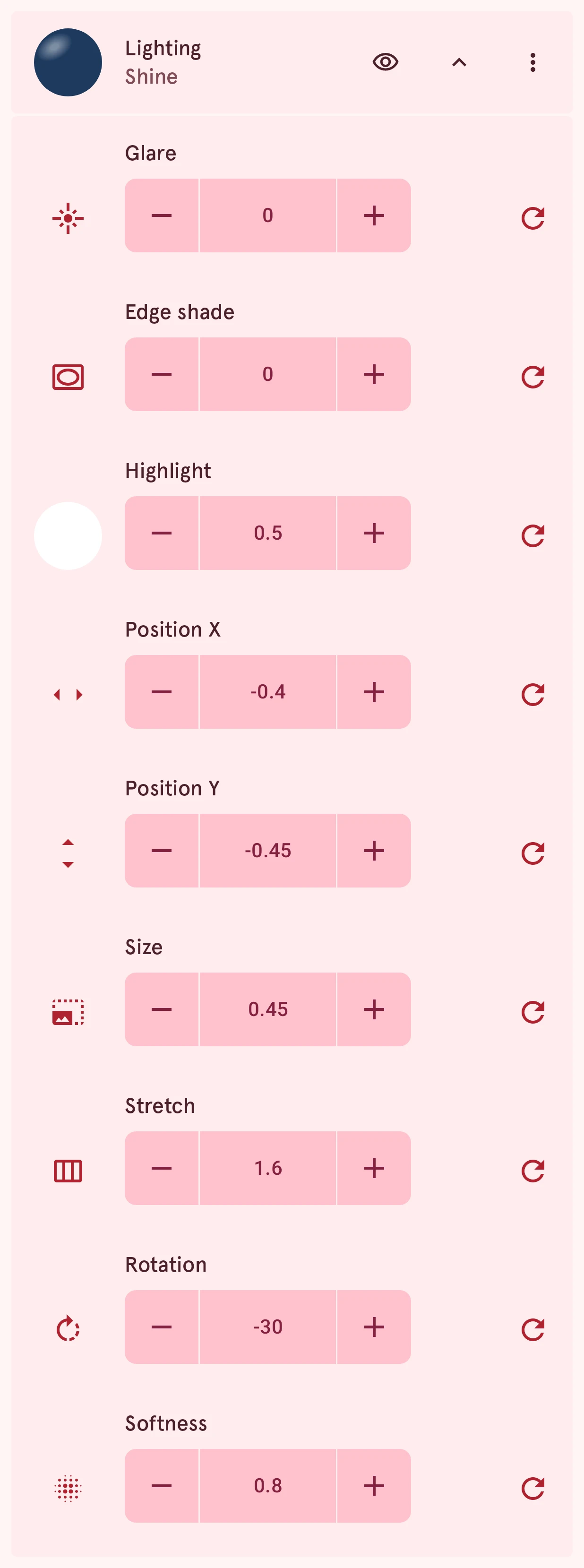
Glare
NumberA glass reflection: a band of light over the whole fill, as on a watch glass or a lacquered surface. It works over any paint, pattern or texture.
0.00 to 1.00, steps of 0.01
Glare angle
NumberWhich way the glare band runs, in degrees clockwise from 12 o’clock. The band is the same both ways, so 0 and 180 look alike. Shown once there is glare.
0 to 360, steps of 1
Edge shade
NumberDarkens the fill toward its edges, the way a screen looks seen at an angle.
0.00 to 1.00, steps of 0.01
Highlight
NumberA soft spot of light on the fill, as on a glossy button. 0 is no spot; raise it and the spot appears toward the top left, with the settings below to place and shape it.
0.00 to 1.00, steps of 0.01
Highlight color
ColorThe spot’s color; its swatch sits in the Highlight row. White is light; another color tints it, and black turns the spot into a shade.
Position X
NumberWhere the spot sits across the element: -1 is the left edge, 1 the right edge.
-1.50 to 1.50, steps of 0.01
Position Y
NumberWhere the spot sits up and down: -1 is the top edge, 1 the bottom edge.
-1.50 to 1.50, steps of 0.01
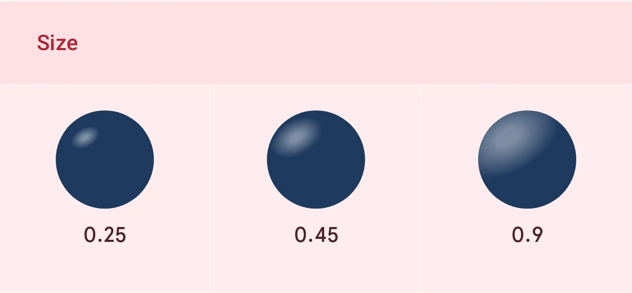
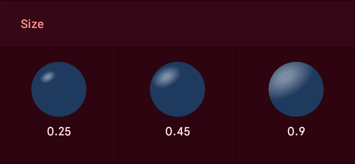
Size
NumberHow big the spot is, as a share of half the element’s larger side.
0.05 to 2.00, steps of 0.01
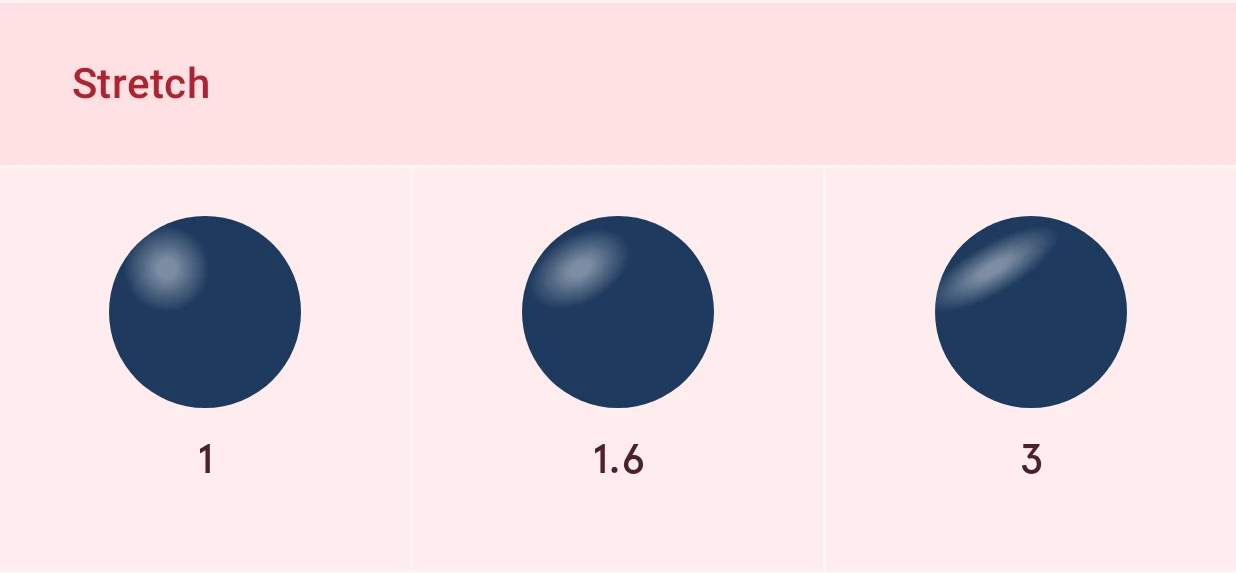
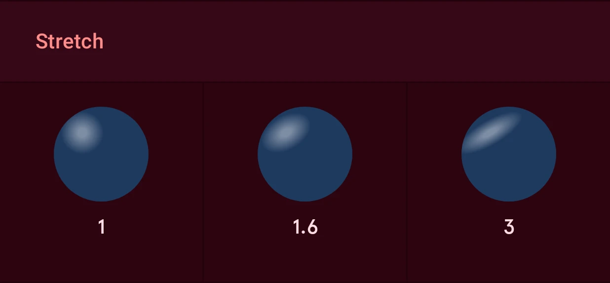
Stretch
NumberThe spot’s shape: 1 is a circle, more a wide oval, less a tall one.
0.25 to 4.00, steps of 0.05
Softness
NumberHow the spot fades: 0 is a hard edge, 1 fades out all the way from its middle.
0.00 to 1.00, steps of 0.01
The highlight’s size and stretch:
Light and shade along the edges, so the shape stands out of the dial or is pressed into it. One per fill; the border has its own. Here on gold:
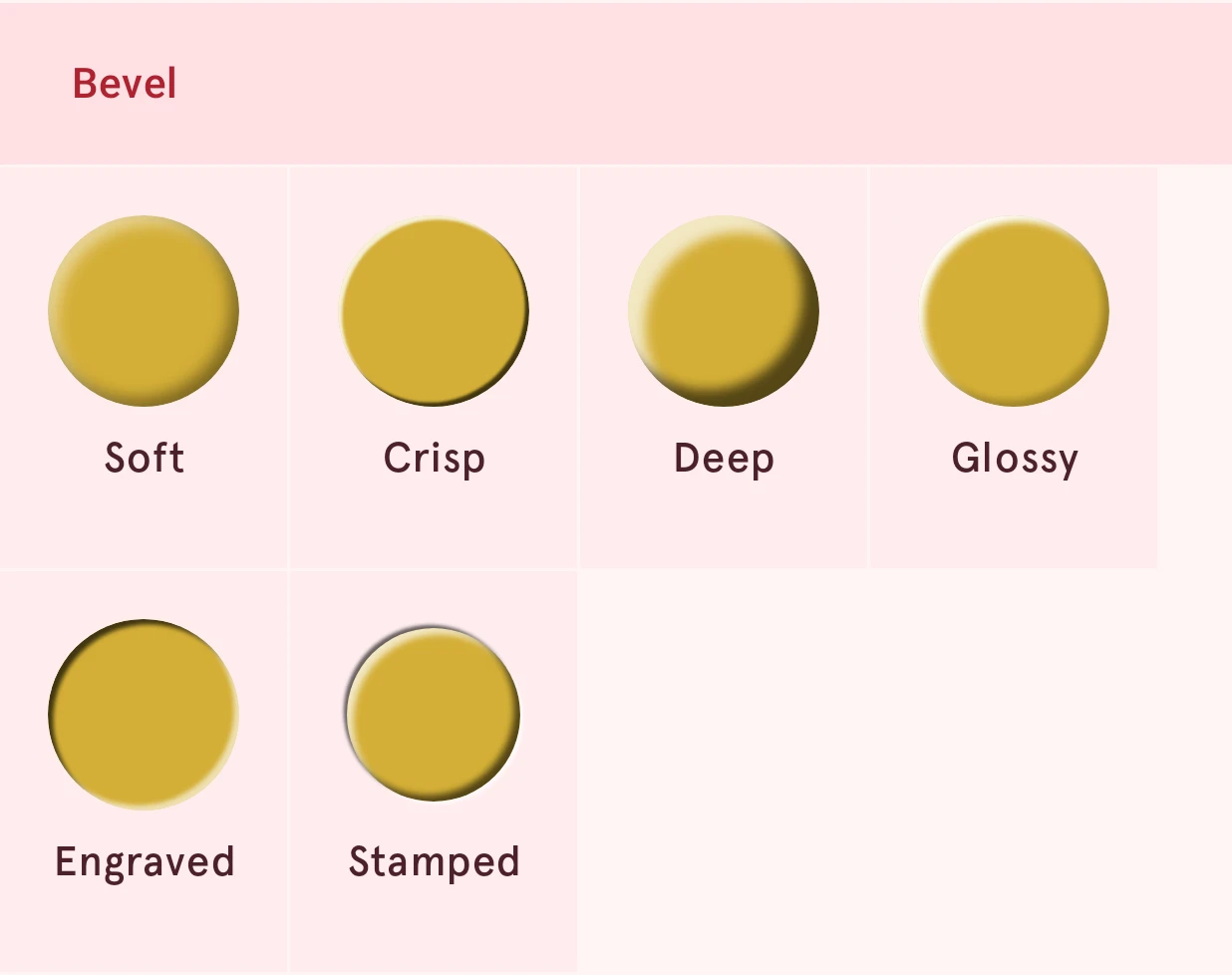
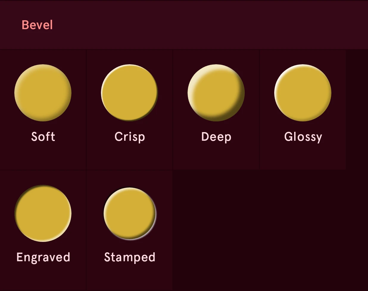
- Soft: a gentle, rounded rise.
- Crisp: a narrow, hard edge, as on a machined part.
- Deep: a thick, rounded slab.
- Glossy: a bright lit edge with only a hint of shade, as on lacquer or enamel.
- Engraved: cut into the surface (Pressed).
- Stamped: pressed into the surface around it, with a groove outside the edge (Pillow). It shows best on a lit surface, so put the element on a plate rather than straight on black.
A bevel keeps its light angle and colors when you pick another look, so all your elements stay lit from the same side.
Bevel settings
Section titled “Bevel settings”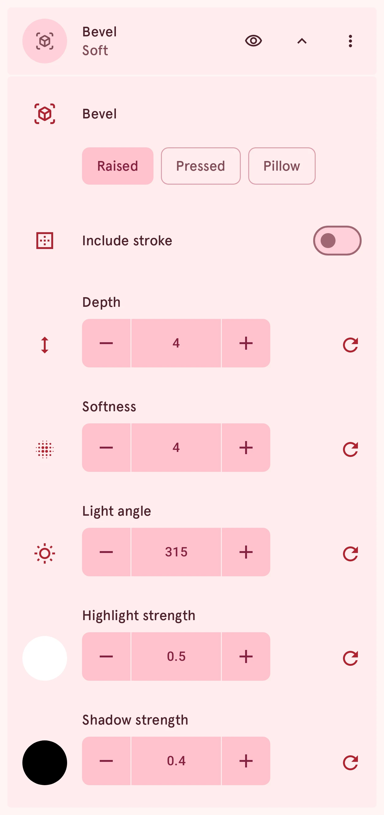
Bevel
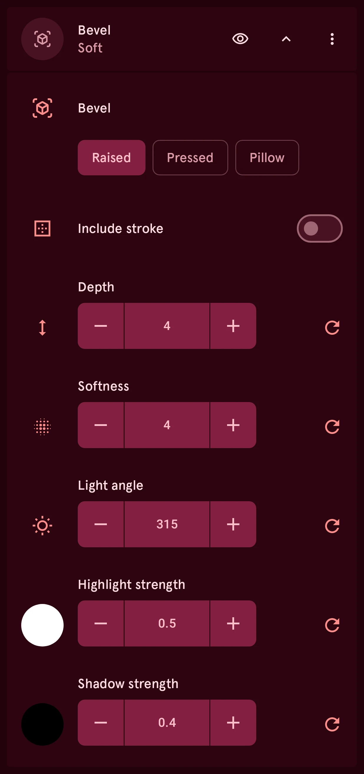
ChoiceThe bevel’s look. Raised lights the edges facing the light and shades the far ones, so the shape stands out; Pressed does the opposite, so it’s pressed in. Pillow is raised with a groove just outside the edge, as if stamped into the surface around it; it reads best on a lit surface, so put the element on a plate rather than straight on black. The Presets row gives you a finished look (Soft, Crisp, Deep, Glossy, Engraved, Stamped) to start from.
- Raised
- Pressed
- Pillow
Include stroke
SwitchBevels the fill and the border as one surface, instead of the fill alone. Use it when the border is part of the shape, such as a thick outline around a hand.
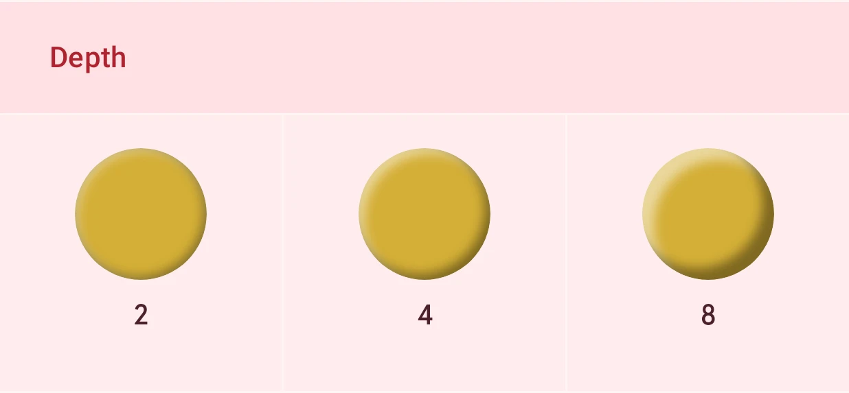
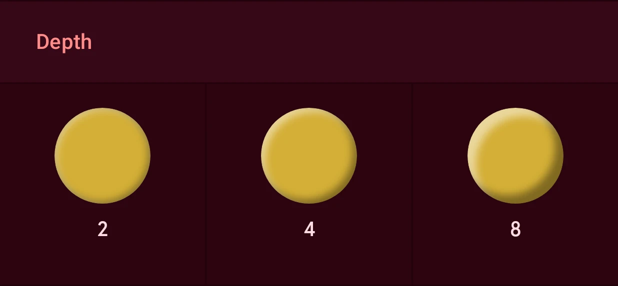
Depth
NumberHow far the light and shade bands reach in from the edge. A watch face is 320 units across; a few units suit indices and hands, more suits big shapes and lettering.
0.0 to 40.0, steps of 0.1
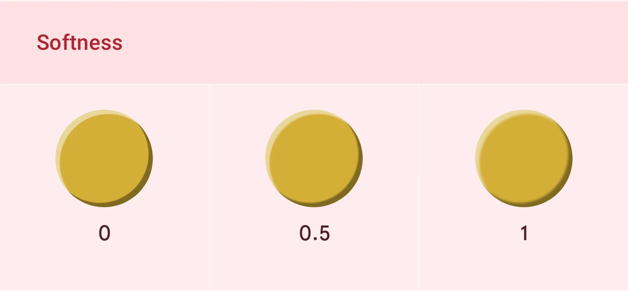
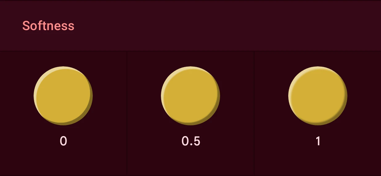
Softness
NumberHow soft the bands’ inner edge is: 0 is a sharp step, higher values blend the bands smoothly into the surface.
0.0 to 40.0, steps of 0.1
Light angle
NumberWhere the light comes from, in degrees clockwise from 12 o’clock. The default, 315, is the top left, the usual light on a watch face. Give every element the same angle so they’re lit alike.
0 to 360, steps of 1
Highlight strength
NumberHow visible the lit band is, from 0 (none) to 1.
0.00 to 1.00, steps of 0.01
Highlight
ColorThe color of the band on the side facing the light, white by default; its swatch sits in the row above. A colored highlight tints the lit edge, for example warm on gold.
Shadow strength
NumberHow visible the shaded band is, from 0 (none) to 1.
0.00 to 1.00, steps of 0.01
Shadow
ColorThe color of the band on the far side, black by default; its swatch sits in the row above.
The bevel’s depth and softness:
What’s not supported on Wear OS 6
Section titled “What’s not supported on Wear OS 6”Colors, gradients and polished metal look the same on the watch. Textures, patterns and lighting do too: on an element that doesn’t change the watch shows it as a picture, and on an automated element or text with tags the effect is drawn inside the element’s shape. A few combinations can’t go along:
- Effects without a fill, on an element that changes: you can set the fill style to None and still add effects, so only the effect shows (just a dot pattern, or just a glass reflection). On the watch that works on an element that never changes, but not on one that does (an automated element, or text that shows live data like the time): there the watch draws the effects inside the layer’s fill, and there is none. Pick a fill style for that layer, or move the effects to a layer that has a fill. The same goes for the border.
- Bevel: not on a moving arc or an automated complication image. On text that changes, only a bevel on the fill alone works: not on the border, and not with Include stroke. A bevel on a moving shape or image moves along.
- A color that changes (automated) on a beveled shape or image.
When one of these applies, the element shows an issue that says why, and the watch face can’t be sent until you change it. A hidden effect never blocks sending.