Layer types
What is special about shapes, text, arcs, images, icons and groups, including a shape's point actions.
Every layer can be moved, scaled, rotated, styled and automated. What a layer is made of decides the rest: which tools work on it, which actions its menu offers, and which pages its style buttons open.
Shapes
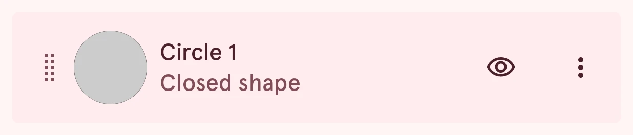
Section titled “Shapes”A shape is a path of anchor points: closed (a circle, a polygon) or open (a line). Circles, squares, polygons, lines, generated shapes and imported SVGs are all shapes, so they all work the same once they’re added. Tap the style swatch on a shape’s row to give it a fill, a border and a shadow (see Layer style):
- Tap an anchor point with the Select tool to select it, and drag it to move it.
- The pen adds points to the end of an open shape; Add point adds points anywhere along it.
- A shape is styled with a fill, a border and a shadow.
- Shapes are the layers you can round, combine with each other, and use as a mask or an outline.
Point actions
Section titled “Point actions”When you select an anchor point, its actions slide in at the edge of the canvas. A toggle shows what it switches to: a curved point offers Corner, a sharp one Curve.


Round corner
Rounds this one corner. Drag the slider that appears on the canvas, then tap Round again or tap outside the slider to keep it.
Corner
Makes the curved point a sharp corner.
Curve
Makes the sharp point a curve, with two handles to shape it.
Unlock
Lets the two handles of the curve move on their own, for a sudden bend.
Lock
Keeps the two handles in line, so the curve stays smooth.
Delete
Removes the point from the shape.
Delete & open
Removes the point and opens the shape there, so a closed shape becomes an open line. Only on closed shapes.
Rounding corners
Section titled “Rounding corners”To round every sharp corner of a shape at once, tap the more button on its row and pick Round corners:
Round corners asks for the radius and previews the result before you apply it.
To round one corner, select its anchor point and tap Round in the point actions, then drag the slider on the canvas:
Combining shapes
Section titled “Combining shapes”Two or more shapes can be combined into one: joined, cut out of each other, or reduced to where they overlap. Long-press a shape in the layer list, tap the other shapes to add them, then tap Combine in the app bar:


Combine shapes lets you pick how they combine (union, subtract, intersect or exclude), which shape’s style the result gets, and which shape the others are cut out of, with a preview. The selected shapes are replaced by the result; undo brings them back. Only shapes can be combined: deselect any text, icon, image or group layers first.
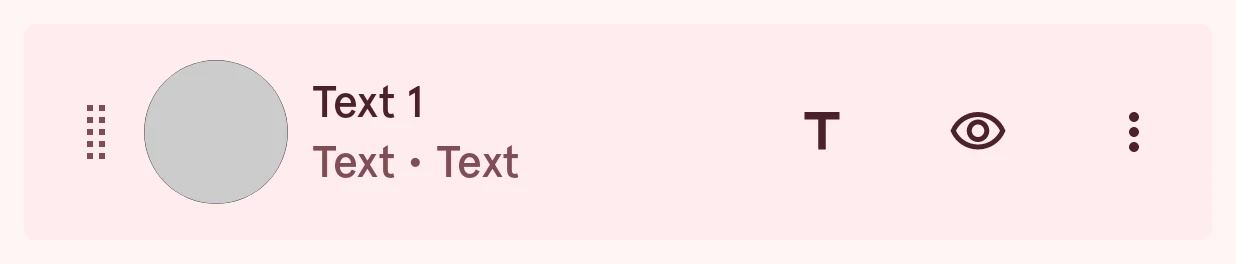
A text layer shows text in a font of your choice, picked in the font picker from the Font row of its content page. In a dynamic element, text can include data tags that show live data, such as the time, the date or the battery level. Convert to shape in its menu turns the letters into an editable shape. Tap the content button on its row for its content page:
Text
TextThe text itself. In a dynamic element it opens the text editor, where you can insert data tags; in an index it asks for the number the mark shows; otherwise you type it.
Can be automated.
Type
ChoiceHow the text is sized and laid out. Regular uses a fixed size on one line. Fit to bounds grows or shrinks the text to fill its box, and Fit max bounded does the same up to the max text size. Curved puts the text on a circle, as around a dial.
- Regular
- Fit to bounds
- Fit max bounded
- Curved
Text size
NumberThe size of the text, for the Regular layout.
0.0 to 1000.0, steps of 0.1
Max text size
NumberThe largest size the Fit max bounded and Curved layouts may grow the text to, so a short text doesn’t become huge.
0.0 to 1000.0, steps of 0.1
Start angle
NumberCurved text only: where on the circle the text is centered. 0 is 12 o’clock; positive values move it clockwise.
-360.0 to 360.0, steps of 0.5
Can be automated.
Vertical scale
NumberCurved text only: flattens the letters toward the circle. 1 keeps their full height.
0.000 to 1.000, steps of 0.001
Flip direction
SwitchCurved text only: runs the text the other way, so text at the bottom of a dial reads left to right instead of upside down.
Casing
ChoiceShows the text as typed, in capitals, or in small letters, whatever the data says.
Alignment
ChoiceLines the text up to the left, the center or the right of its box.
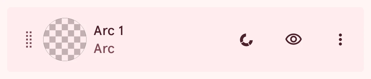
An arc is a part of a circle, drawn as a thick line: its thickness is the border width. Arcs are the usual way to show progress (the battery level, your steps), and their angles can be automated. An arc can be the element’s outline. Tap the content button on its row for its content page:
Start angle
NumberWhere the arc begins, in degrees. 0 is 3 o’clock and the angle grows clockwise, so 12 o’clock is 270.
0.0 to 360.0, steps of 0.1
Can be automated.
Sweep angle
NumberHow far the arc runs from its start: positive goes clockwise, negative the other way, and 360 is a full ring. Automate it to show progress.
-360.0 to 360.0, steps of 0.1
Can be automated.
Part angle
NumberSplits the arc into repeated parts of this many degrees. A part angle as big as the sweep draws one solid arc; with a thick border and a small part angle, the parts become ticks around a dial.
0.0 to 360.0, steps of 0.1
Gap angle
NumberThe space between the parts, in degrees. Round or square line ends grow every part a little and can close small gaps, so use flat ends for tick rings.
0.0 to 360.0, steps of 0.1
Stroke position
ChoiceWhich side of the arc’s circle the thickness grows to: inside (the outer edge stays put), centered on it, or outside.
Images
Section titled “Images”An image layer shows a picture, picked with Image source. Tap the content button on its row for its content page, which adjusts it:
Icon color
ColorColors a single-color image, such as the icon a complication provides. Ordinary pictures use the adjustments below instead.
Keep aspect ratio
SwitchKeeps the image’s proportions when its box changes shape, instead of stretching it.
Crop to round
SwitchCuts the image to a circle.
Image outline
SwitchFill, stroke and shadow follow the image's shape instead of its box
Traces the picture’s own shape, so a fill, border or shadow follows the picture instead of its rectangle. Handy for a cut-out picture with a transparent background.
Outline smoothness
NumberHow much the traced outline is smoothed: 0 follows every detail, 1 rounds it off.
0.00 to 1.00, steps of 0.01
Opacity
NumberHow see-through the image is, from 0 to 1.
0.000 to 1.000, steps of 0.001
Brightness
NumberMakes the image darker (below 0) or lighter (above 0).
-255.0 to 255.0, steps of 0.1
Contrast
NumberLowers or raises the contrast; 1 leaves it as it is.
Steps of 0.001
Saturation
NumberHow colorful the image is: 0 is black and white, 1 leaves it as it is.
Steps of 0.001
Hue
NumberShifts every color around the color wheel, in degrees.
-180.0 to 180.0, steps of 0.1
An icon is a glyph from one of the app’s icon fonts. It’s picked from the icon picker, and like a shape it can be a mask for the layers below it. An icon is drawn like text, so the content button on its row opens the same content page as text, for its size and look:
Groups
Section titled “Groups”A group holds other layers, so they move, scale and rotate as one. To make one, long-press a layer in the list, tap the others to add them, then tap Group in the app bar, which shows the selection actions while layers are selected:
Fold a group open or closed in the layer list. A group can be flipped, but it has no style pages of its own: each layer in it keeps its own style.
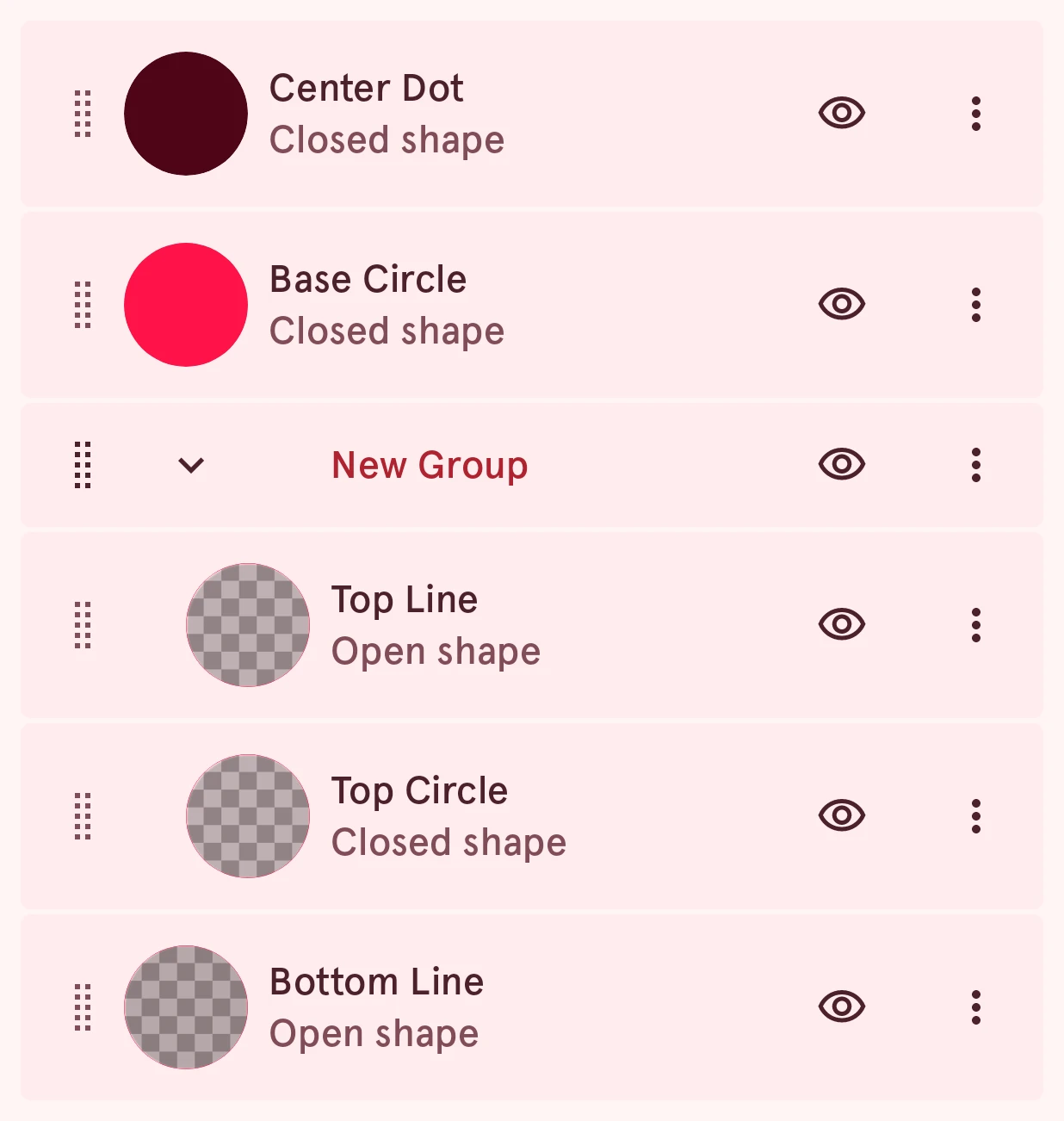
This is Ixion, a watch hand, with its shaft and top circle grouped. The group row has the arrow that folds it, and the layers in it sit indented under it: