
Watch face designer
Where you put a watch face together from elements, with every button, tab and menu it has.
The watch face designer is the first screen of the app: a preview of your watch face, and below it the elements the face is made of. You build a face by adding elements (watch hands, indices, dynamic elements, complications, clocks and more), placing them and setting them up. To change what an element looks like, you open it in the watch element designer.
On a phone the preview sits on top and the tabs below it. Drag the bar above the tabs to give the preview or the list more room. On a wider screen the preview and the tabs sit side by side, and on a very wide screen the palette and the simulator get a column of their own next to the elements.
Each part has a page of its own:
- Elements: the element list, adding elements and what you can do with an element.
- Changing a number: how every number setting works (tap, hold, or type a value).
- Element types: every kind of element, with a page of its own for each: what it’s for, how to add one, and its settings.
Canvas
Section titled “Canvas”The preview of your watch face, on the watch it will run on. Pinch to zoom in and out and drag to move around; a tap on the watch face does what it would do on the watch, such as a tap target’s action.
Zoom in
Zooms in on the middle of the watch face.Reset zoom
Shows the whole watch face again, at its normal size.Zoom out
Zooms out again.
The zoom buttons can be turned off, or set to hide while you don’t use them, with the Zoom controls setting.
The selected element
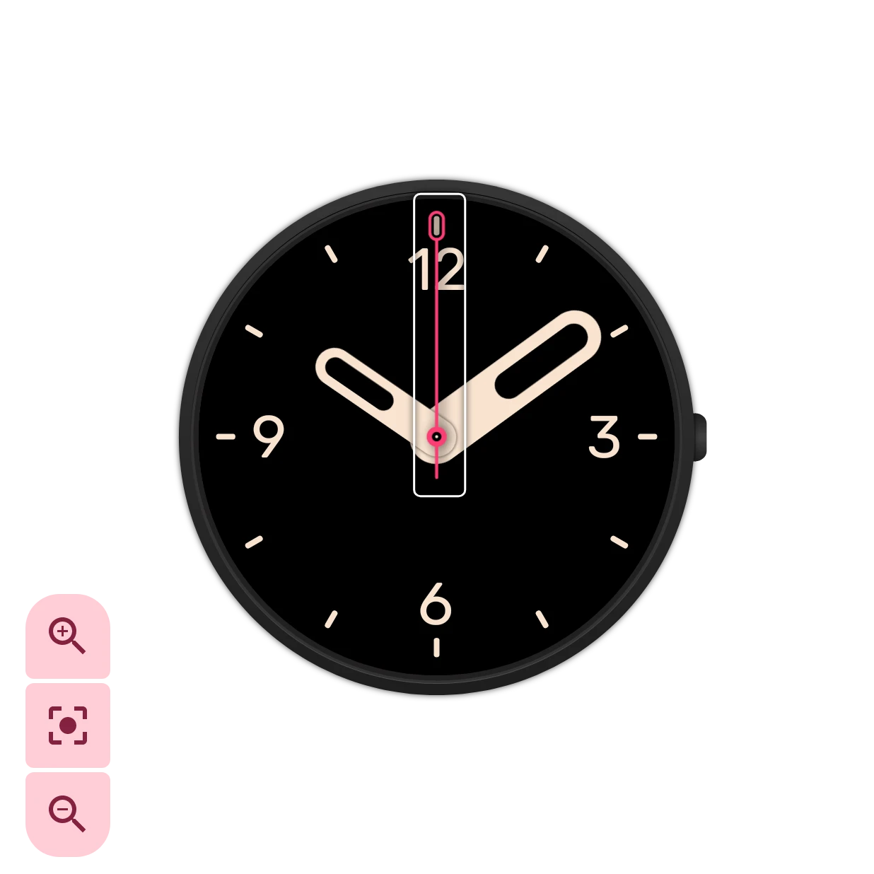
Section titled “The selected element”Tap an element’s row to select it. The row turns a shade lighter:


and the canvas outlines the element, so you can see which element you’re working on and how far it reaches. Here it’s the seconds hand.
Toolbar
Section titled “Toolbar”The toolbar above the preview. There is no More menu: saving under another name is in the watch face info, which the save status opens.


Undo
Takes back the last change. The number on the icon is how many steps you can go back.
Redo
Puts back a change you took back. The number shows how many steps you can redo.Saved
Your changes are saved by themselves; this shows how that’s going. A spinner means a change is about to be saved, a pulsing save icon that it’s being saved, and this icon that everything is saved. A red mark means saving failed. On the free version a padlock means the watch face isn’t in one of your saved slots yet: tap it to pick a slot. Otherwise a tap opens the watch face info.
Opens the watch face info.
Send to watch
Sends the watch face to your watch. For a Wear OS 6 watch the app turns it into a watch face the watch installs, so check the elements with a warning sign first: those can’t go to the watch as they are. See Sending to your watch.
Watch face info
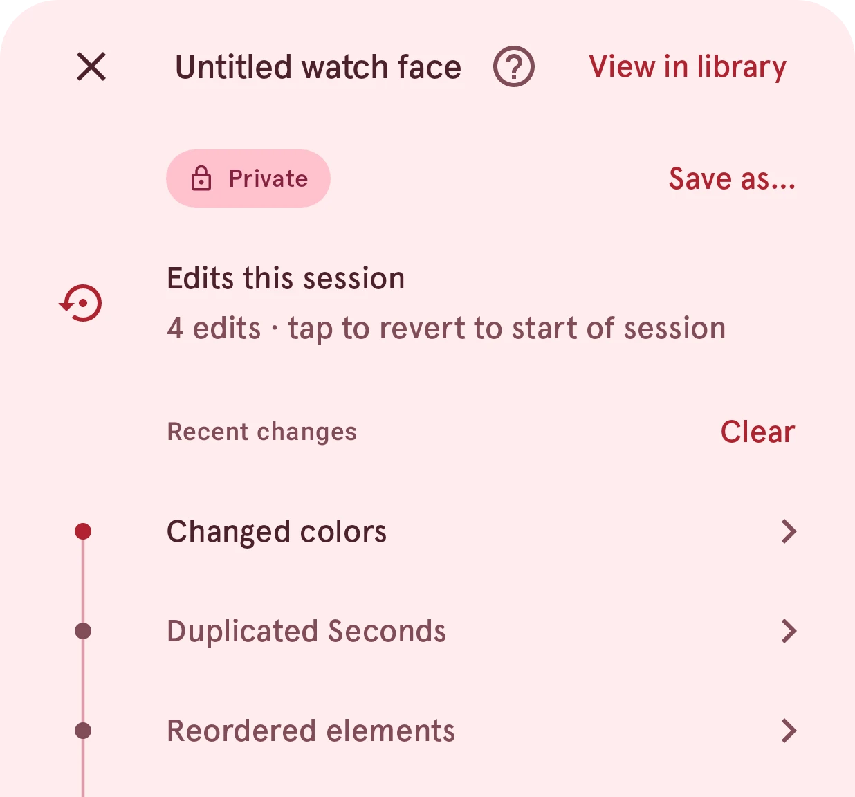
Section titled “Watch face info”The save status opens this sheet: the watch face’s name and what you changed this time.
View in library
Opens the watch face in the Library, on its details.Private
Who can see the watch face in the Library: only you (private), everyone (public), or not yet, while it waits for review. Local means it’s only on this phone. See Local, private, pending, public.
Save as…
Saves the watch face under another name, as a new watch face.Edits this session
How many changes you made since you opened the watch face. Tap it to go back to how it was then.
Recent changes
Your latest changes, newest on top. Tap one to go back to just before it; you see the result first, and going back can be undone like any other change. Clear, next to the heading, empties this watch face’s undo history after you confirm; the watch face itself doesn’t change. The list and your undo stay with the watch face when you open another one and come back, as long as it didn’t change in the meantime (see Keep undo history for).
Below the preview, four tabs switch between the palette, the two element lists and the simulator:


The elements of the watch face as you see it when you look at your watch. See Interactive and ambient.
The elements of the always-on face, which the watch shows while you’re not looking at it.
Interactive and ambient
Section titled “Interactive and ambient”A Wear OS watch face has two looks. The interactive face is the one you see when you raise your wrist or tap the screen. After a few seconds the watch dims the screen to save battery and shows the ambient face (the always-on display) until you look again.
The two are separate lists of elements, on their own tabs. The ambient face should be calm and mostly dark: the watch updates it only once a minute, so leave out the seconds hand, and every lit pixel costs battery. A good start is to copy the interactive elements over (the elements menu’s Copy all elements to ambient) and then remove or darken what the always-on face doesn’t need.
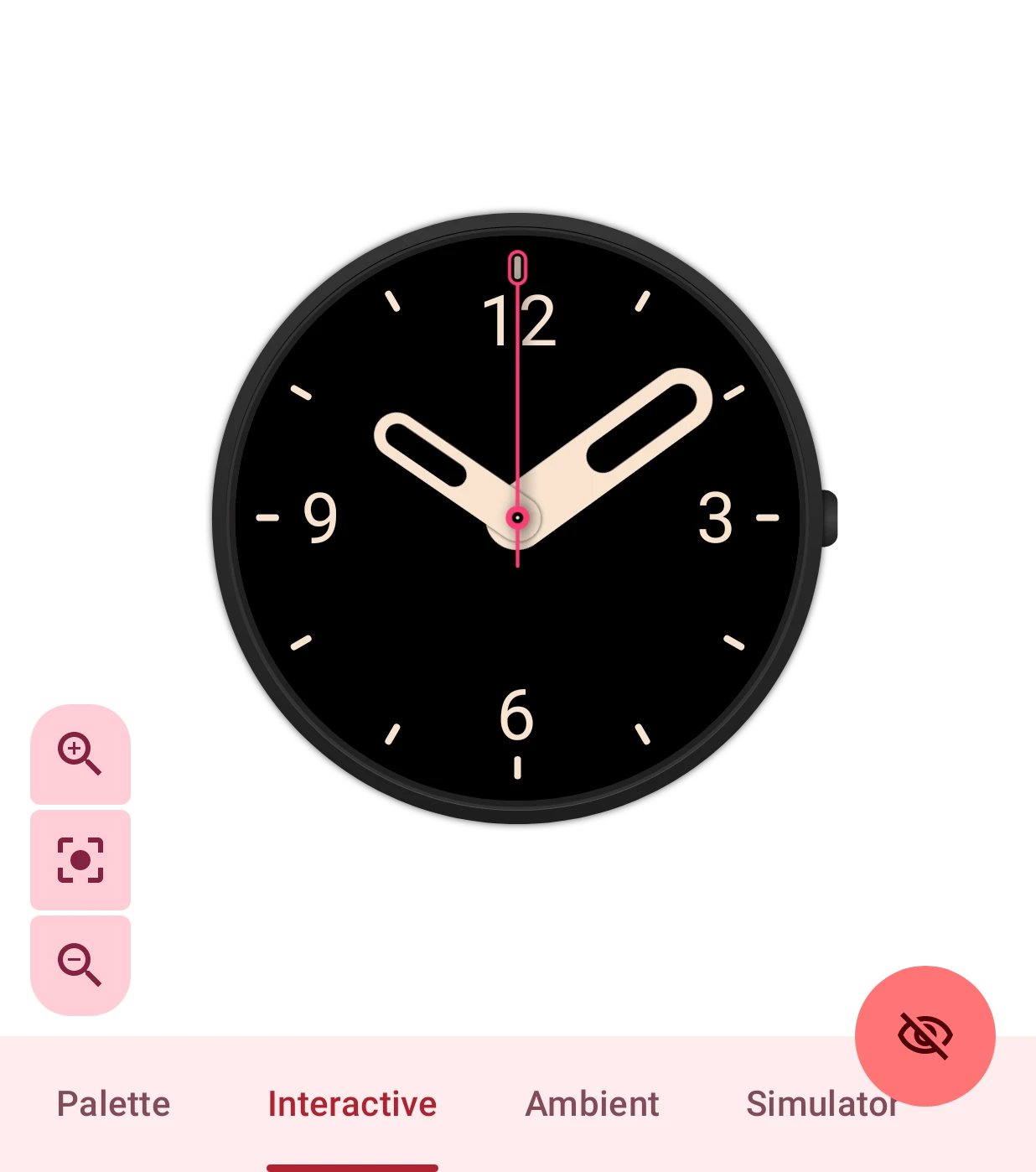
- The elements of the normal face.
- The elements of the always-on face.
Switch to ambient
Switches the preview between the two faces, whichever tab is open. While the preview shows the ambient face, the eye is open: tap it to go back to the interactive face.
The preview follows the tab you pick if the Auto switch views setting is on. Each element’s settings end with how it moves between the two faces.
Palette
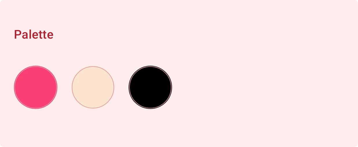
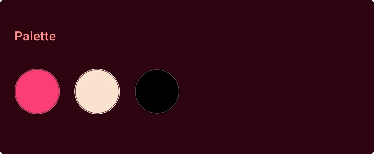
Section titled “Palette”The colors the watch face uses, all in one place. Tap a color to change it, and every element that uses that color changes with it: a quick way to try the whole face in other colors. These are the colors of the Default analog watch face:
If the watch face has images, the tab says so: their colors don’t change with the palette.