
Layer style
The fill, stroke, shadows and glows every layer can have, and reusing a style from another layer.
A layer’s look is its style: what fills it, the stroke around it, and its shadows and glows. Tap a layer’s style swatch in the layer list, and the tools row shows the style buttons, one per page. The check at the end closes the style pages.


Shadows and glows, behind the layer or inside it; see Shadows and glows.
Opens Adjust the effects.
Ready-made styles to apply in one tap; see Styles.
Opens the Styles grid.
Text, arcs, images and icons also get a content page first; their settings are with each layer type.
A setting with an automate button can change with time and data (see Automation). A few settings, or their automation, don’t carry over to a Wear OS 6 watch face; their rows say so.
The style pages
Section titled “The style pages”- Fill: colors, gradients and polished metal, the presets, and the fill’s effects (texture, pattern, lighting and bevel), with every setting.
- Stroke: the line along the outline, its width, ends, corners and dashes, and its own effects.
- Shadows and glows: drop shadows, outer glows, inner shadows and inner glows.
Styles
Section titled “Styles”The Styles button opens a grid of the styles the element’s layers already use: tap one to give the selected layer the same fill, stroke and shadows in one go. This is Ixion, a watch hand, with its four styles:
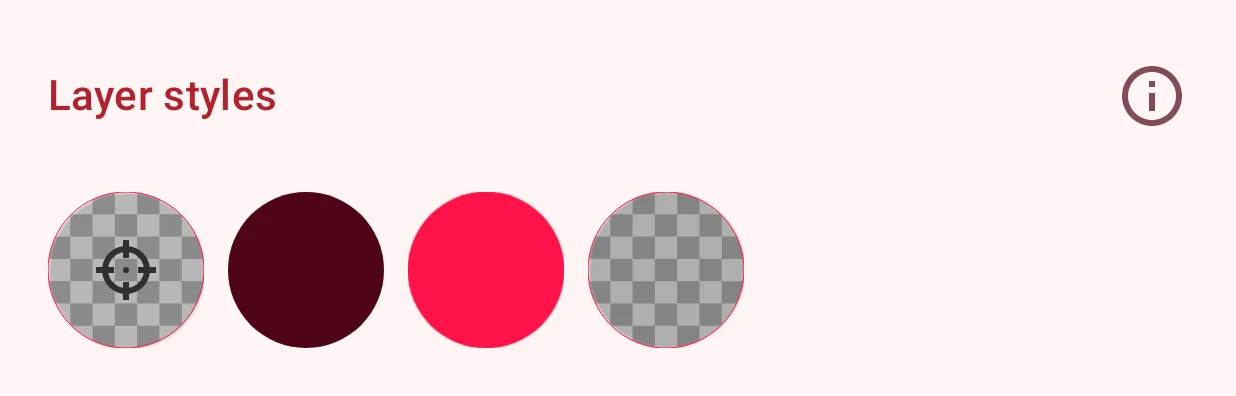
When the style carries automation, the app asks whether to copy the automation too.