
Layers
Adding layers, the layer list, and what you can do with a layer from its menu.
An element is built from layers: shapes, text, arcs, images, icons, and groups that hold other layers. The layer list under the tools row shows them all.
Adding layers
Section titled “Adding layers”Tap the add button at the end of the tools row:


The menu lists everything an element can hold. A new layer is selected right away, ready to edit.
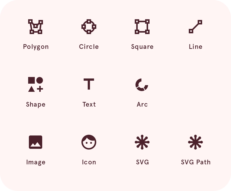
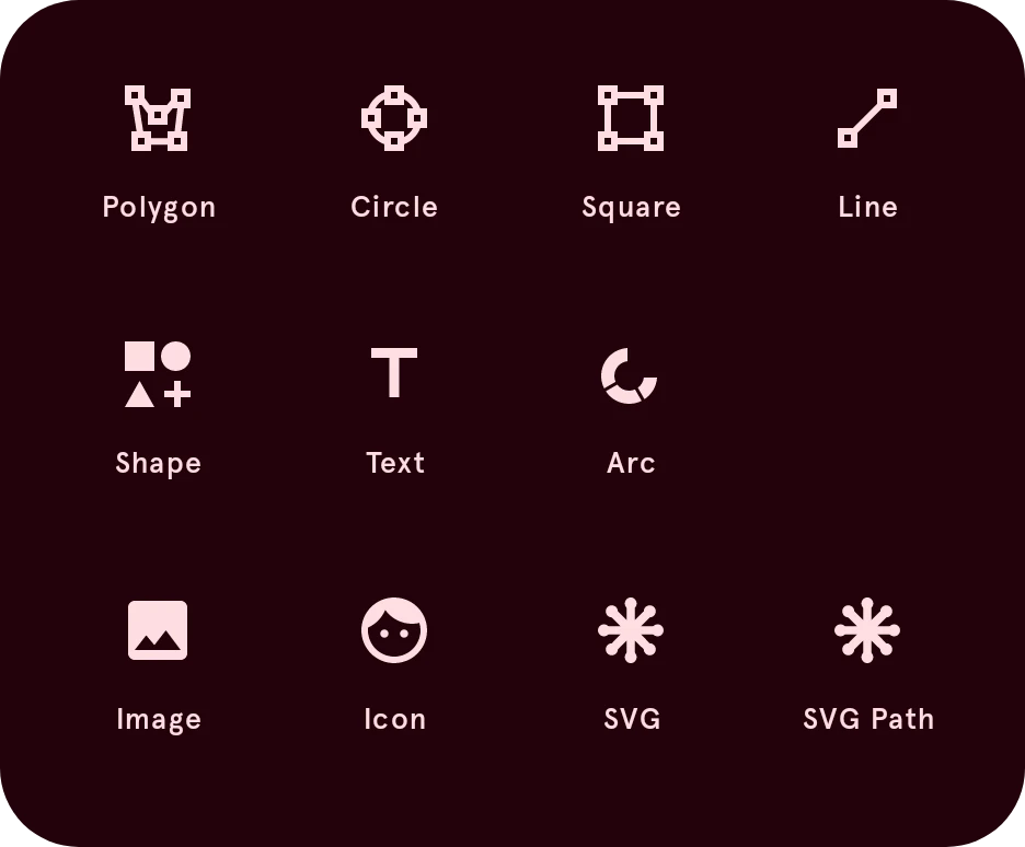
Polygon
Starts a shape that you draw point by point with the pen.
Circle
Adds a circle.
Square
Adds a square. For rounded corners, use Shape, or Round corners in the layer’s actions.
Line
Starts a line that you draw point by point with the pen.
Shape
Opens the shape generator for stars, rings, rounded rectangles and more, each with its own settings. The result is a normal shape you can keep editing.
Opens Add shape.
Text
Adds a text layer. In a dynamic element, text can show live data with data tags, such as the time or the battery level.
Arc
Adds an arc, a part of a circle. Arcs are the usual way to show progress, like the battery level or your steps.
SVG
Imports an SVG file as shapes. If the file uses parts the designer can’t draw, it lists them after the import.
SVG Path
Adds a shape from SVG path data that you paste in, the
dattribute of a path.Opens Add an SVG path.
The layer list
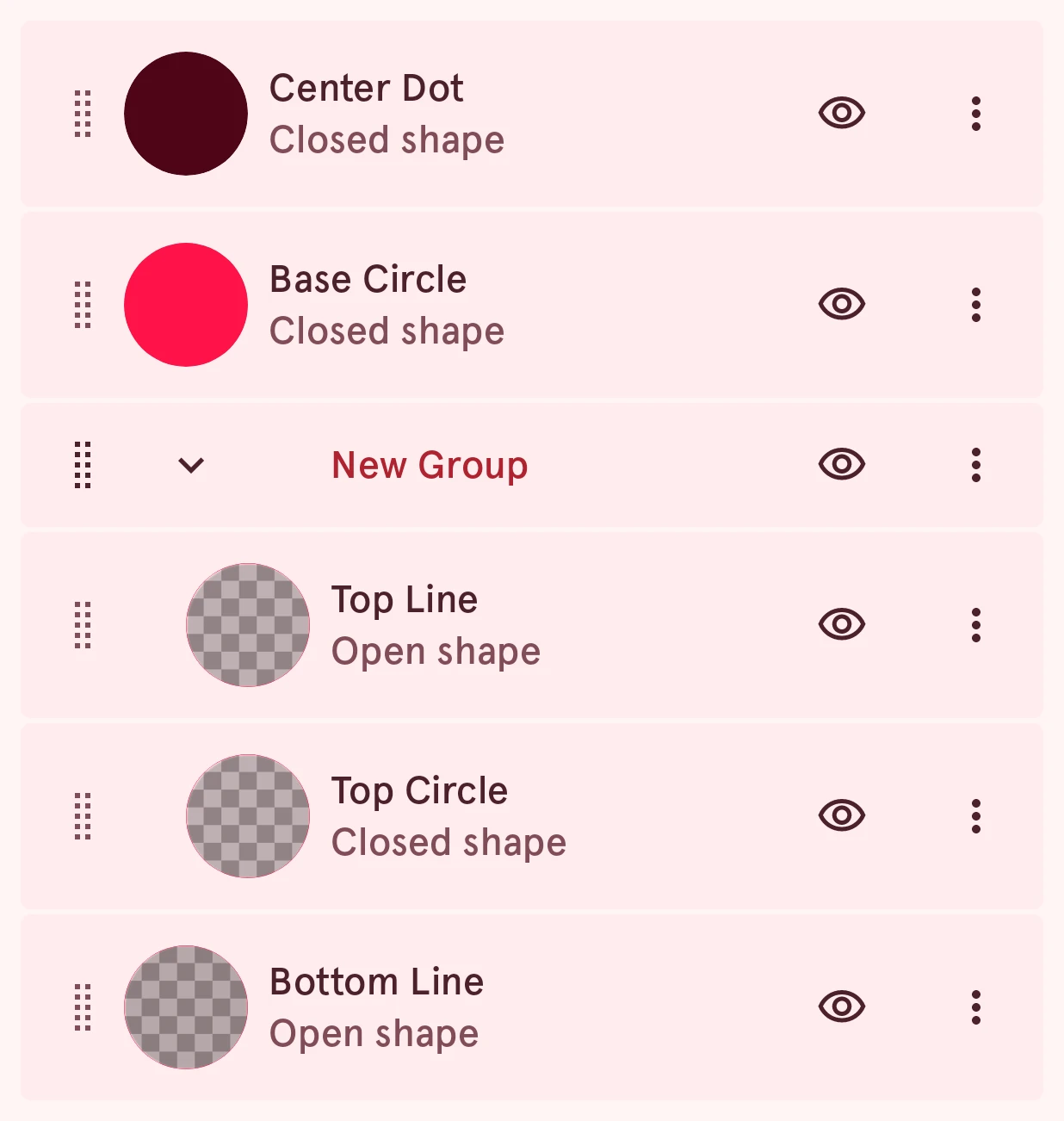
Section titled “The layer list”Tap a row to select its layer. A row shows, from left to right:
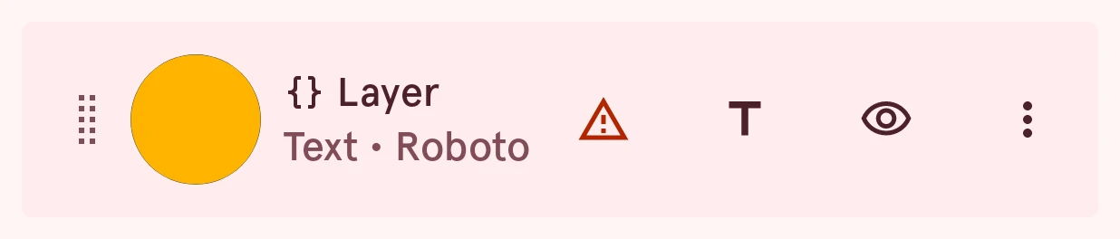
Drag handle
Drag it to move the layer up or down the list.
Style
A small preview of the layer’s look. Tap it to open the layer’s style pages (see the style buttons).
Layer automation
Shows on an automated layer. It turns into a warning when one of its expressions fails.
Name and kind
The layer’s name, and below it what kind of layer it is (closed shape, open shape, text, arc, image, icon), or Locked for a locked layer. A mask or outline says so after the kind.
Wear OS 6 issues
Shows when the layer uses something a Wear OS 6 watch face can’t show. Tap it to see what.
Opens Not yet compatible.
Content settings
On text, arcs, images and icons: their text, angles or picture.
Show or hide
Shows or hides the layer while you design.
More
Opens the layer actions.
A group has an arrow to fold it open or closed; the layers inside it are indented. Long-press a row to select several layers (selecting several layers), and swipe a row away to delete its layer.
Layer actions
Section titled “Layer actions”Tap the more button at the end of a layer’s row:
Its actions open in a sheet, grouped like below. Which ones show depends on the kind of layer.
Duplicate
Adds a copy of the layer, with its style and automation.
Rename..
Gives the layer a name, which helps in a long list.
Opens Rename layer.
Copy to clipboard
Copies the layer, to paste it into this or another element with Paste layer in the More menu.
Arrange
Section titled “Arrange”Move to top
Moves the layer to the top of the list in one step, instead of dragging it.
Move to bottom
Moves the layer to the bottom of the list.
Transform
Section titled “Transform”Flip horizontal
Mirrors the layer left to right.
For shapes, groups, arcs and images.
Flip vertical
Mirrors the layer top to bottom.
For shapes, groups, arcs and images.
Reset rotation center
Moves the layer’s rotation center back to the middle of its shape, after you moved it. The layer turns around this point when it’s rotated or automated.
Set scaling properties…
Choose how this layer stretches when the hand gets longer or thicker.
For a hand whose parts shouldn’t all stretch alike: keep a round hub round, a border its width, or let a part grow around its own center.
For the shape layers of a watch hand.
Opens Scaling properties.
Round corners
Round the hard corners of this shape.
Rounds every sharp corner of the shape at once, by the radius you pick. To round a single corner, select its point and use Round in its point actions.
For shapes.
Opens Round corners.
Convert to shape
Turn the glyphs into an editable shape layer.
Turns the letters into a shape, so you can edit them point by point. After that it’s no longer text you can retype.
For text layers.
Mask and outline
Section titled “Mask and outline”Set as outline
Use this layer's shape as your element's outline.
The outline is the element’s shape for taps: the tap feedback on the watch follows it. An element has one outline, so setting it on another layer moves it there. Without one, a shape named “outline” is used, or else the element’s bounds.
While it's on, it reads Unset as outline.
For shapes and arcs.
Set as clipping mask
Clip the layers below to this layer's shape.
For example, put a circle above an image and make the circle a mask, to show the image only inside the circle.
While it's on, it reads Unset as clipping mask.
For shapes and icons.
Remove
Section titled “Remove”Delete
Removes the layer. Undo brings it back.